Project Brief
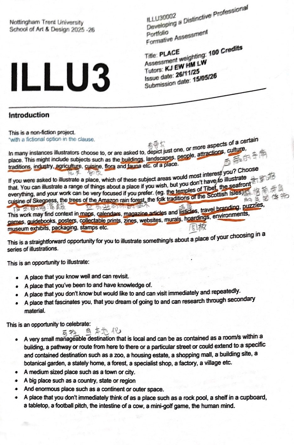
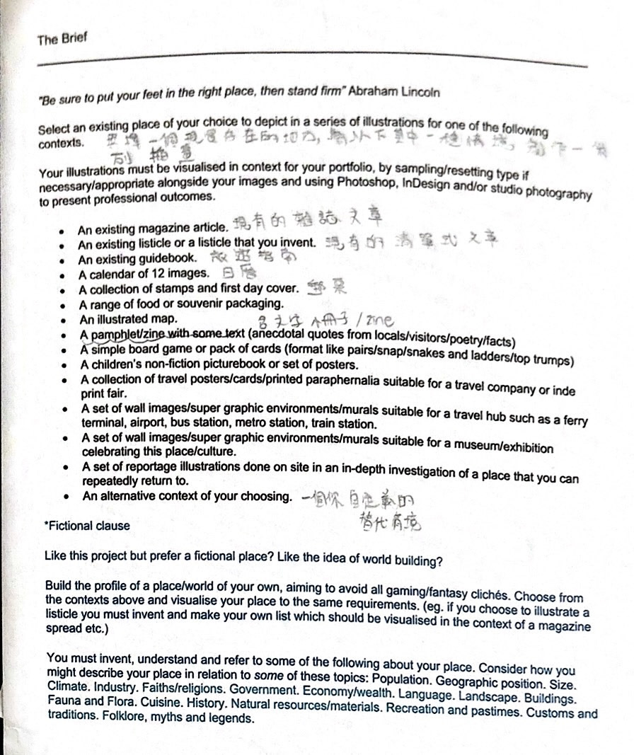
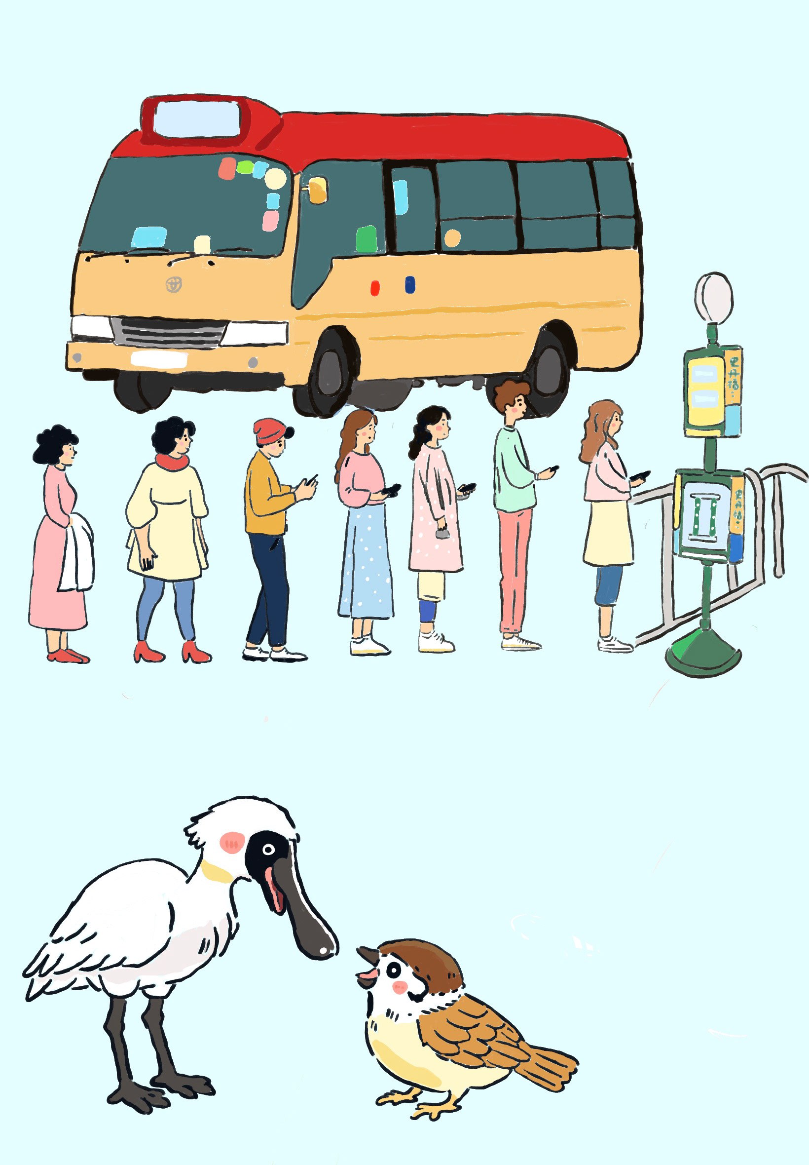
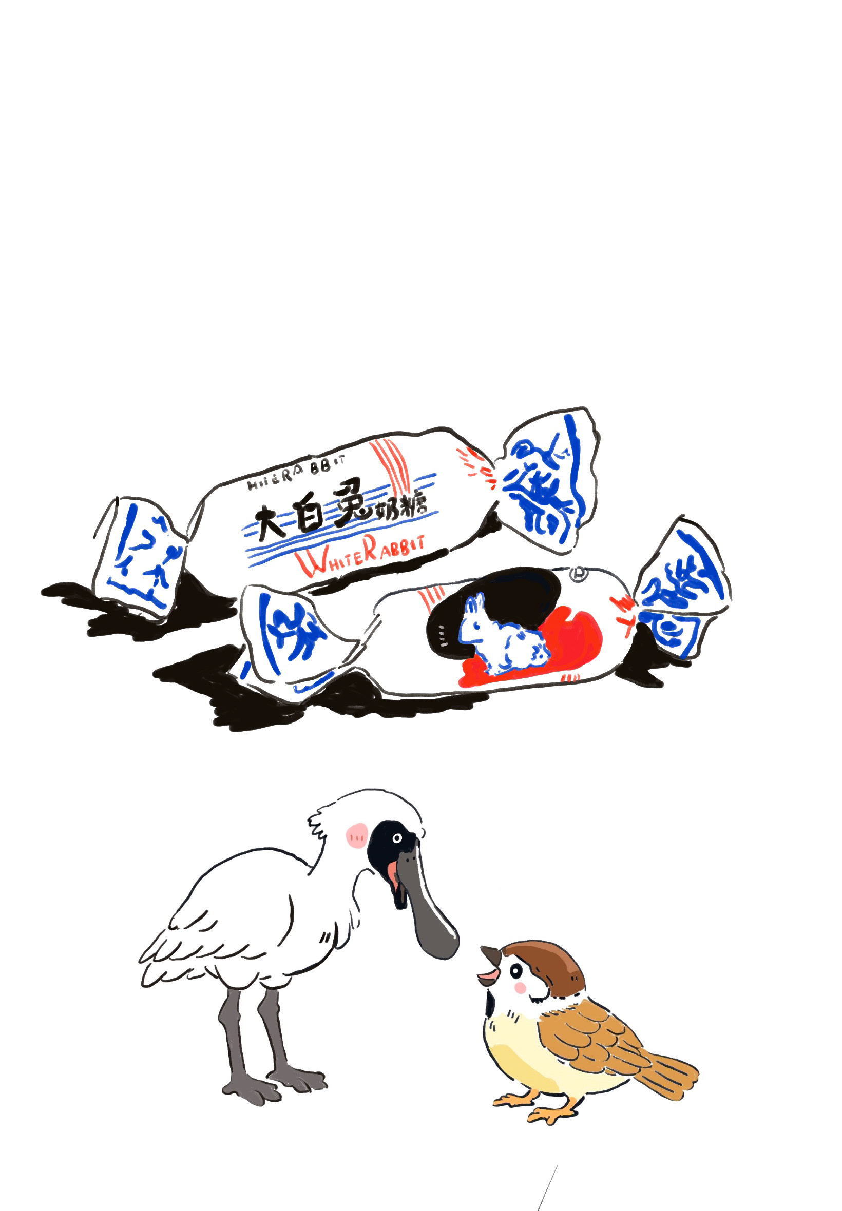
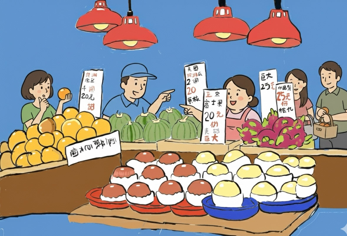
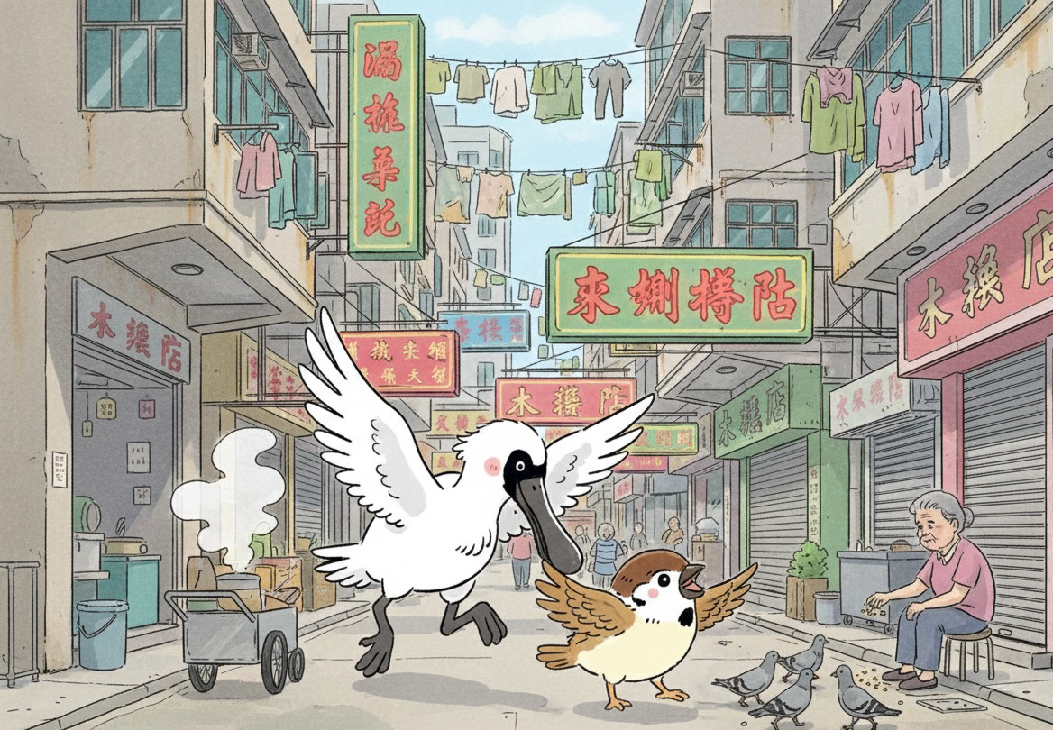
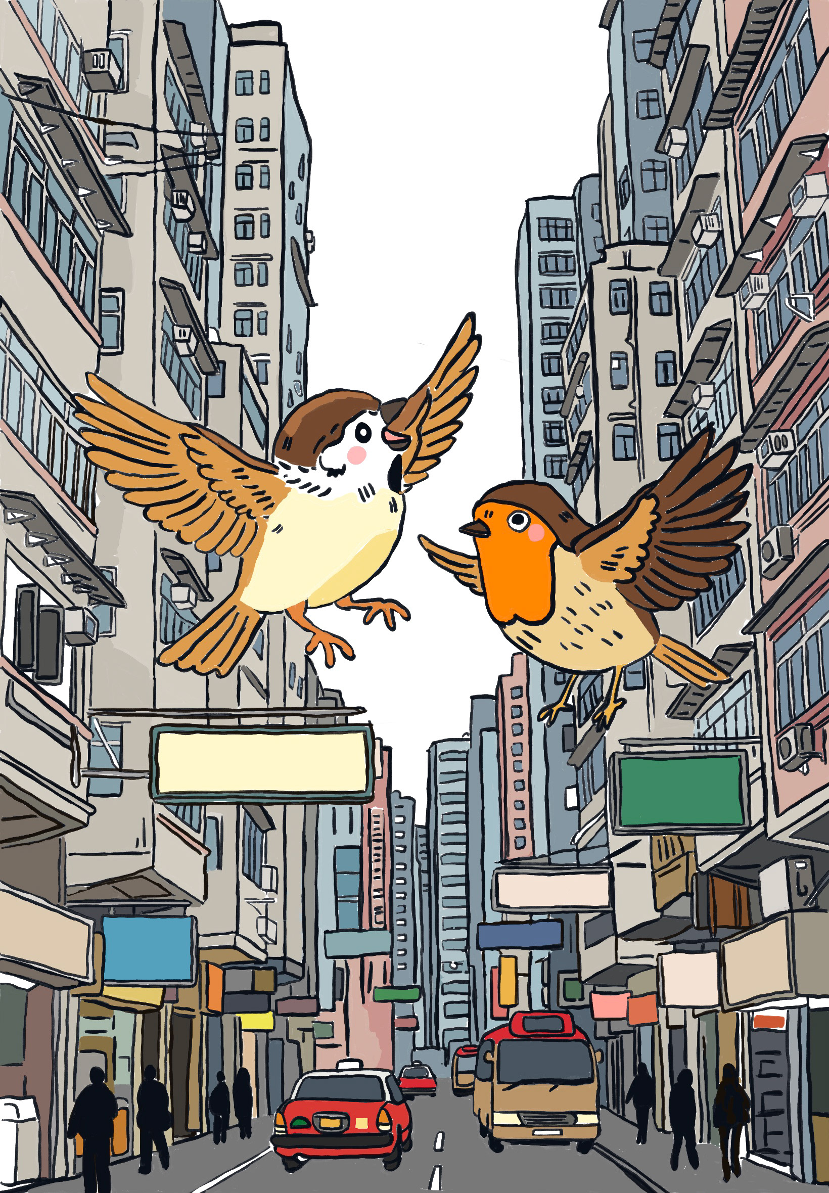
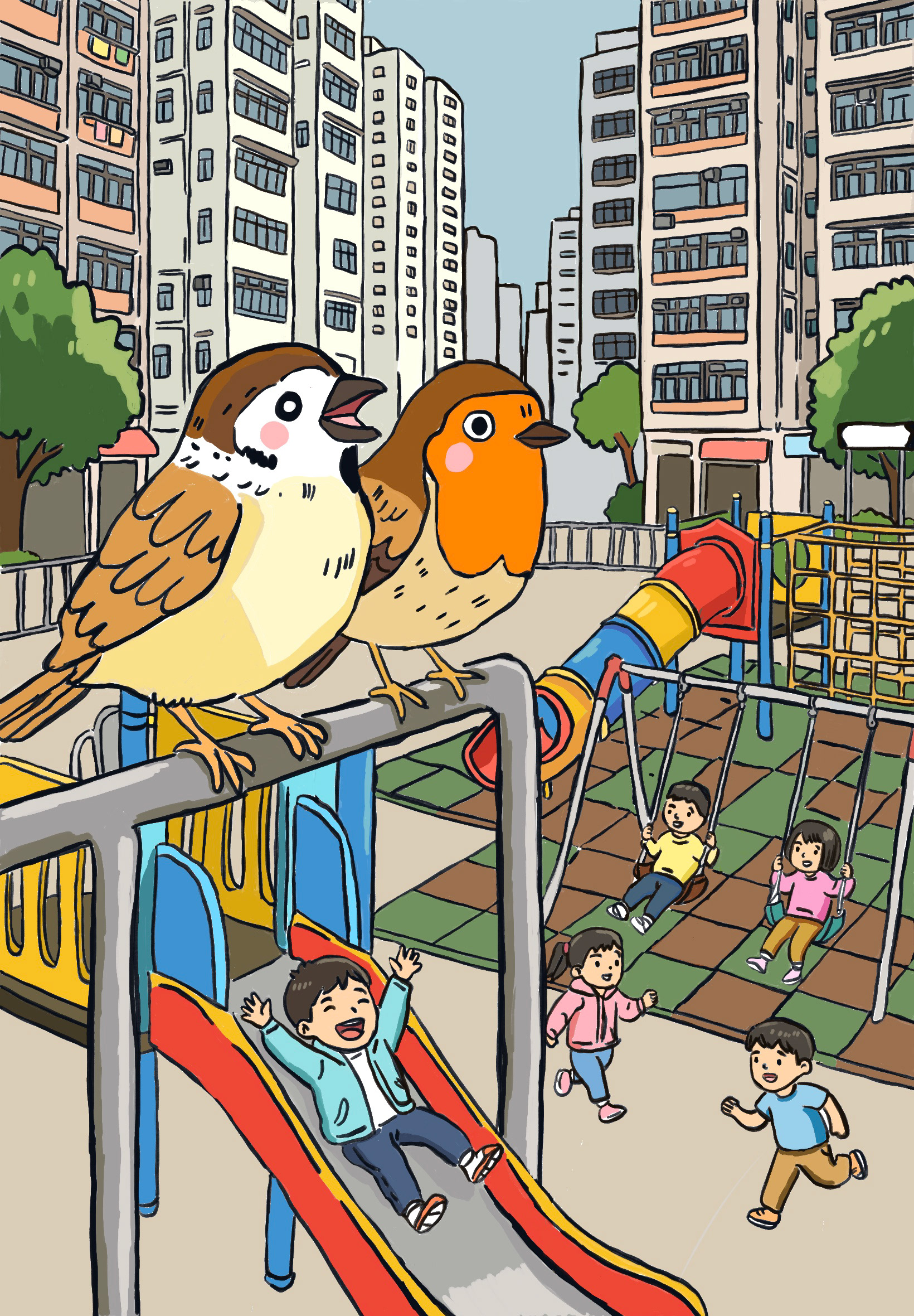
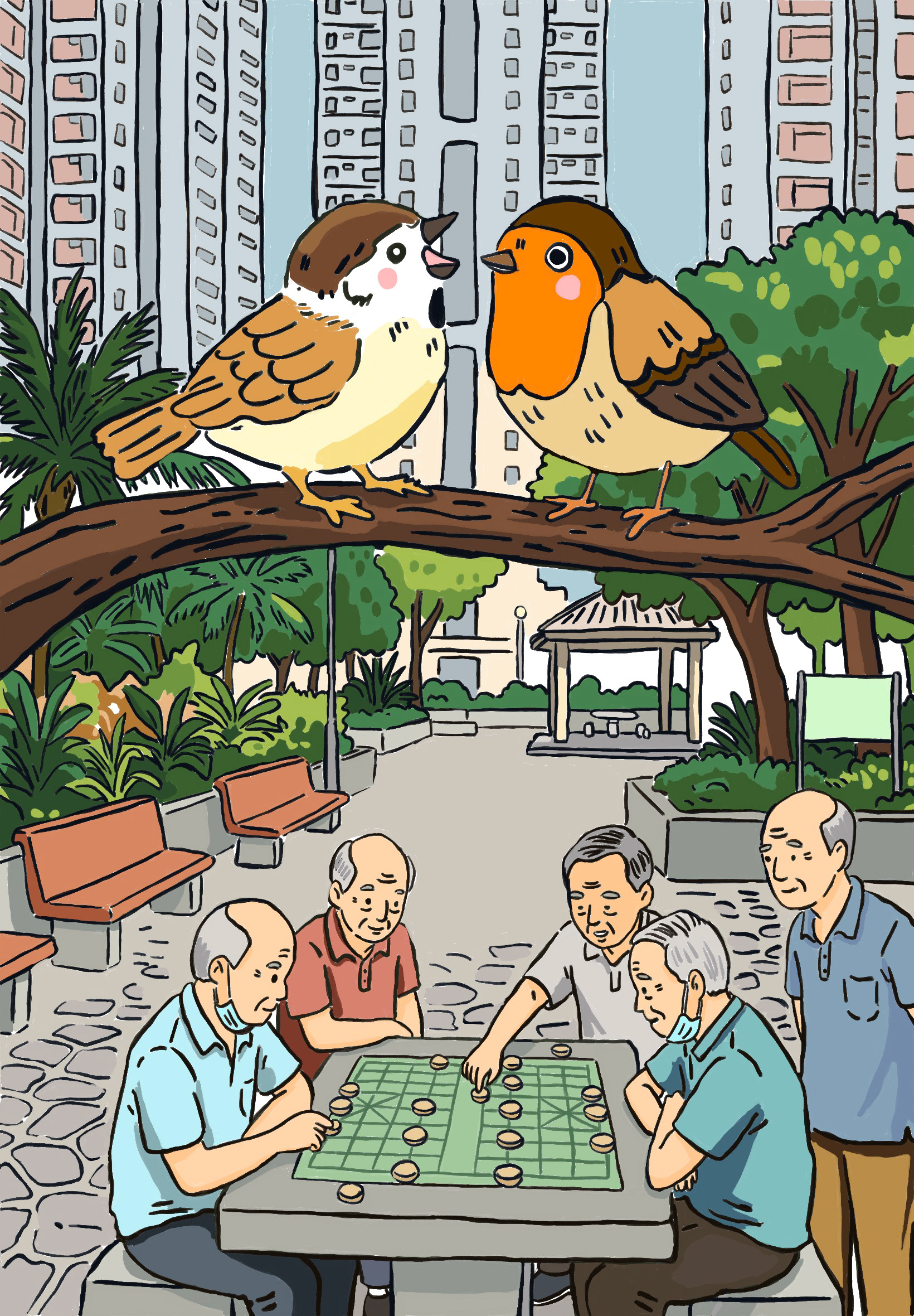
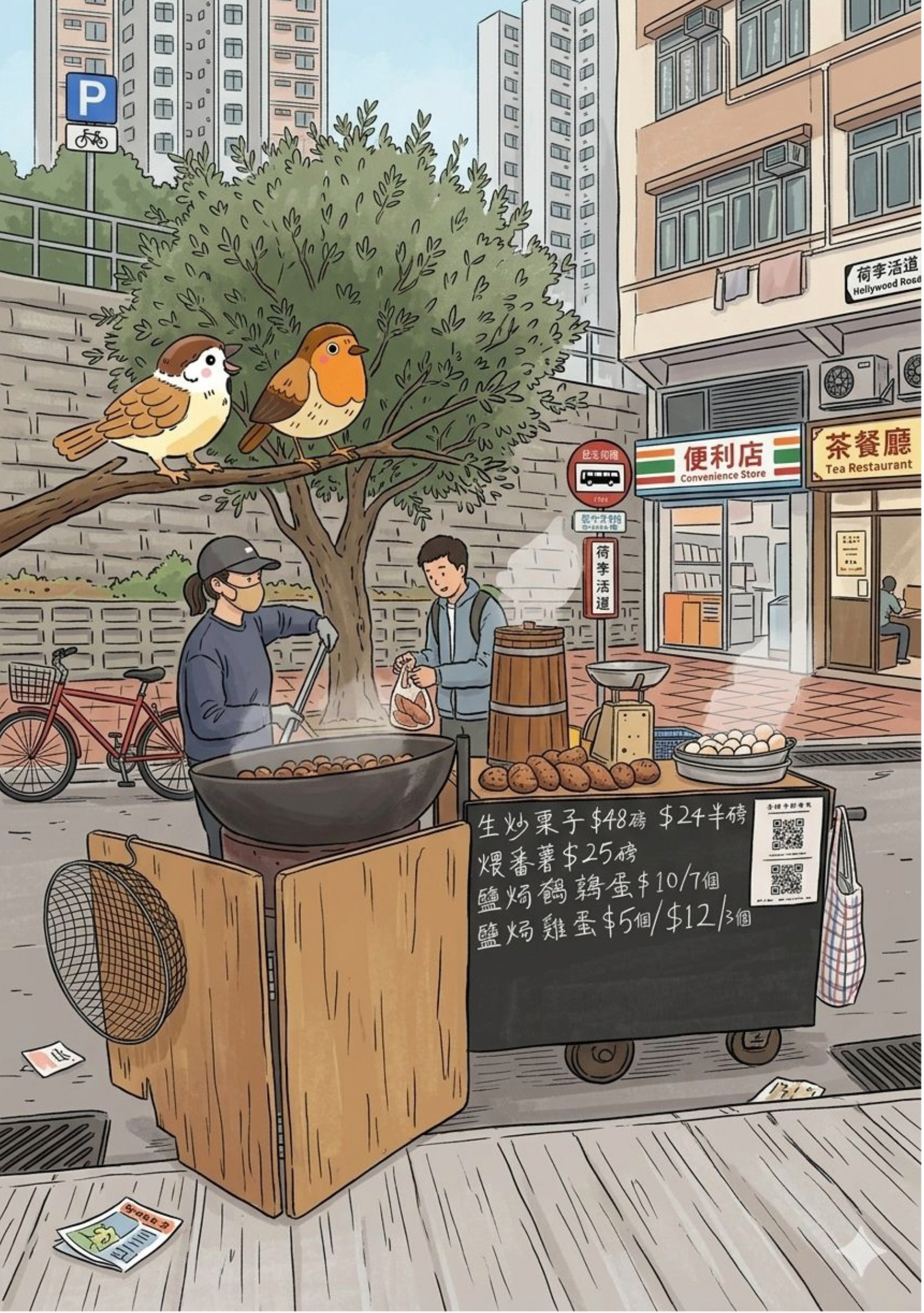
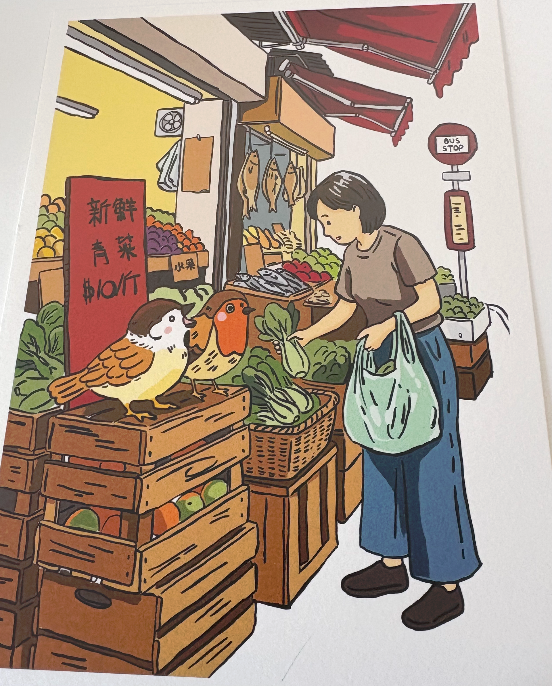
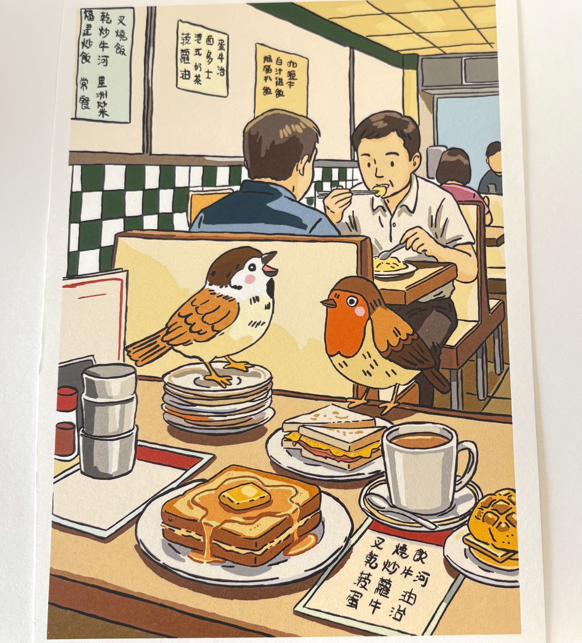
I am going to create a series of prints about a robin who travels to Hong Kong to escape the cold winter. It is his first time in the city, and everything feels both quiet and curious to him. As he explores, he meets a friendly sparrow who knows Hong Kong intimately and offers to show him around. Together, they wander through bustling streets, explore small markets, and marvel at the towering buildings.
At one point, they sit on rooftops and watch the people moving below, taking in the rhythm of city life. The robin feels shy and uncertain at first, but with the sparrow’s warmth and guidance, he gradually begins to feel safe and welcomed. Through this journey, he discovers that even far from home, a new place can offer comfort, connection, and a sense of belonging.
This series will explore themes of curiosity, friendship, adaptation, and finding home in unexpected places. By using animals as characters, I can create a gentle, approachable narrative that captures the emotional experience of navigating unfamiliar spaces while still keeping the story lighthearted and visually engaging.
For this project, I developed the personality of the robin to reflect the emotional journey of someone experiencing a new environment for the first time. The robin is naturally shy and cautious, hesitating at first when facing the unfamiliar city. He is also curious, quietly observing his surroundings and noticing small details, which allows him to engage with the new environment in a thoughtful way.
As the story progresses, the robin becomes more open and trusting, especially through his friendship with the sparrow. This shift shows his capacity for adaptation and growth, highlighting the theme that even in unfamiliar places, one can gradually feel safe and welcomed. The robin is also gentle and sensitive, reflecting an emotional depth that makes him relatable and sympathetic.
I considered how these traits could be shown visually through posture, movement, and facial expression: for example, slightly hunched shoulders or hesitant tilts of the head to convey shyness, wide, curious eyes to show wonder, and relaxed wings when he begins to feel comfortable and safe. By carefully defining the robin’s personality, I can ensure that his emotions and journey are clearly communicated to the audience, making him a memorable and expressive character in the project.
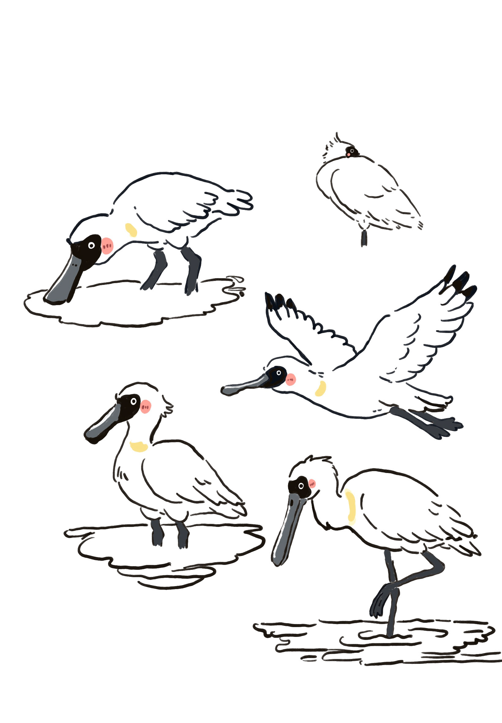
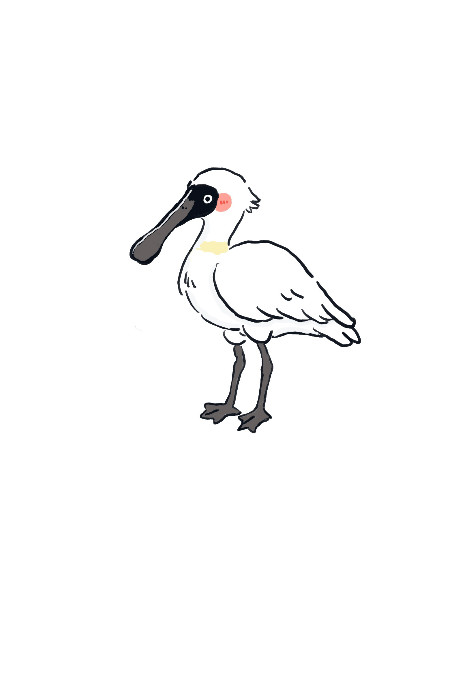
Black face spoonbill
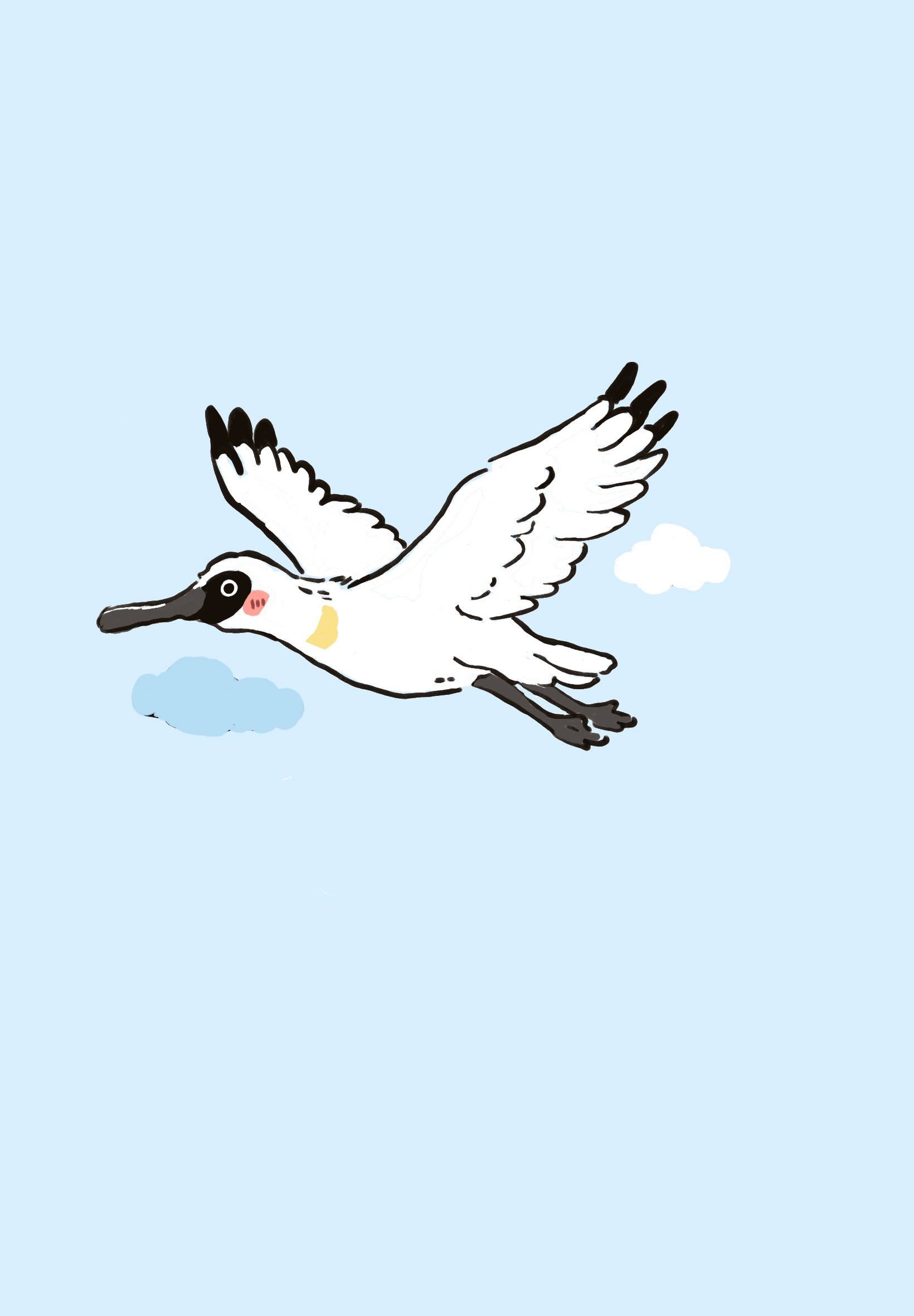
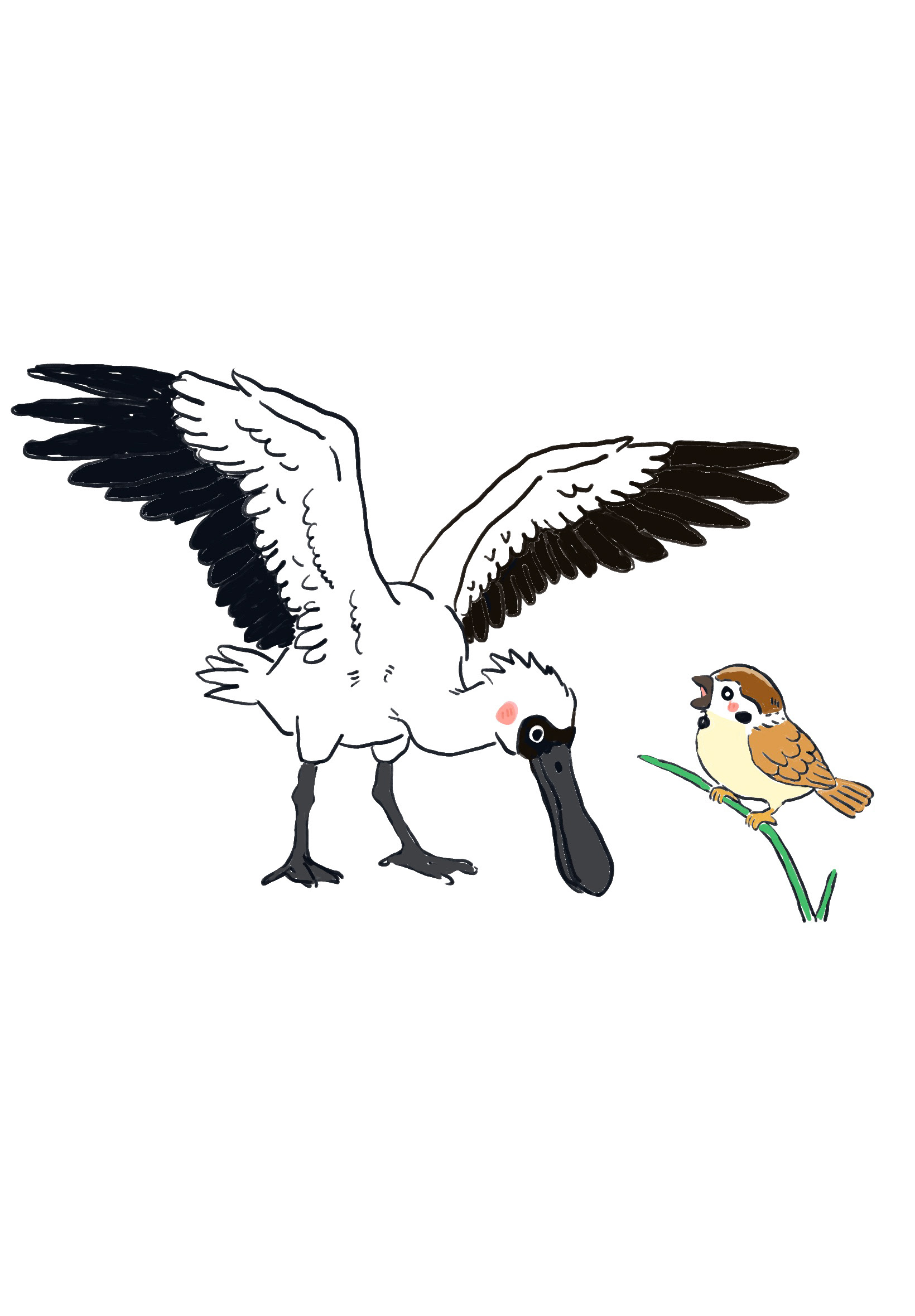
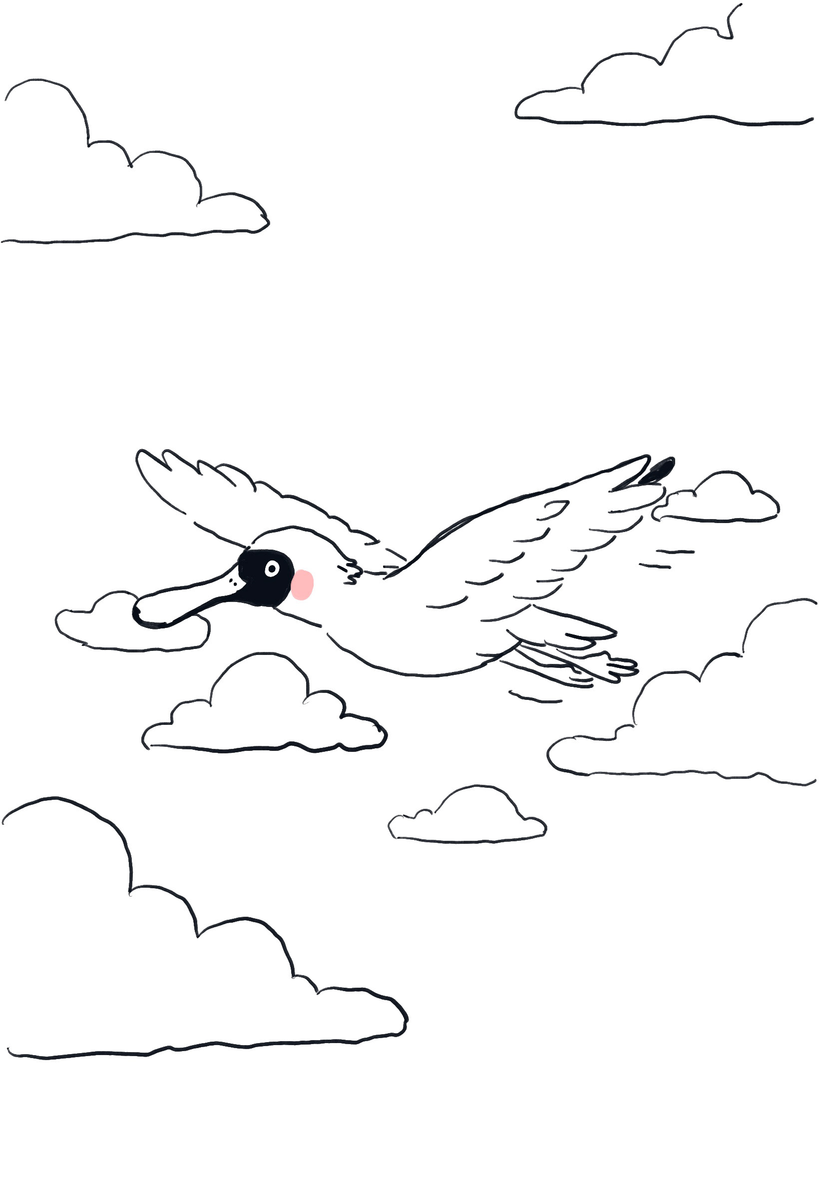
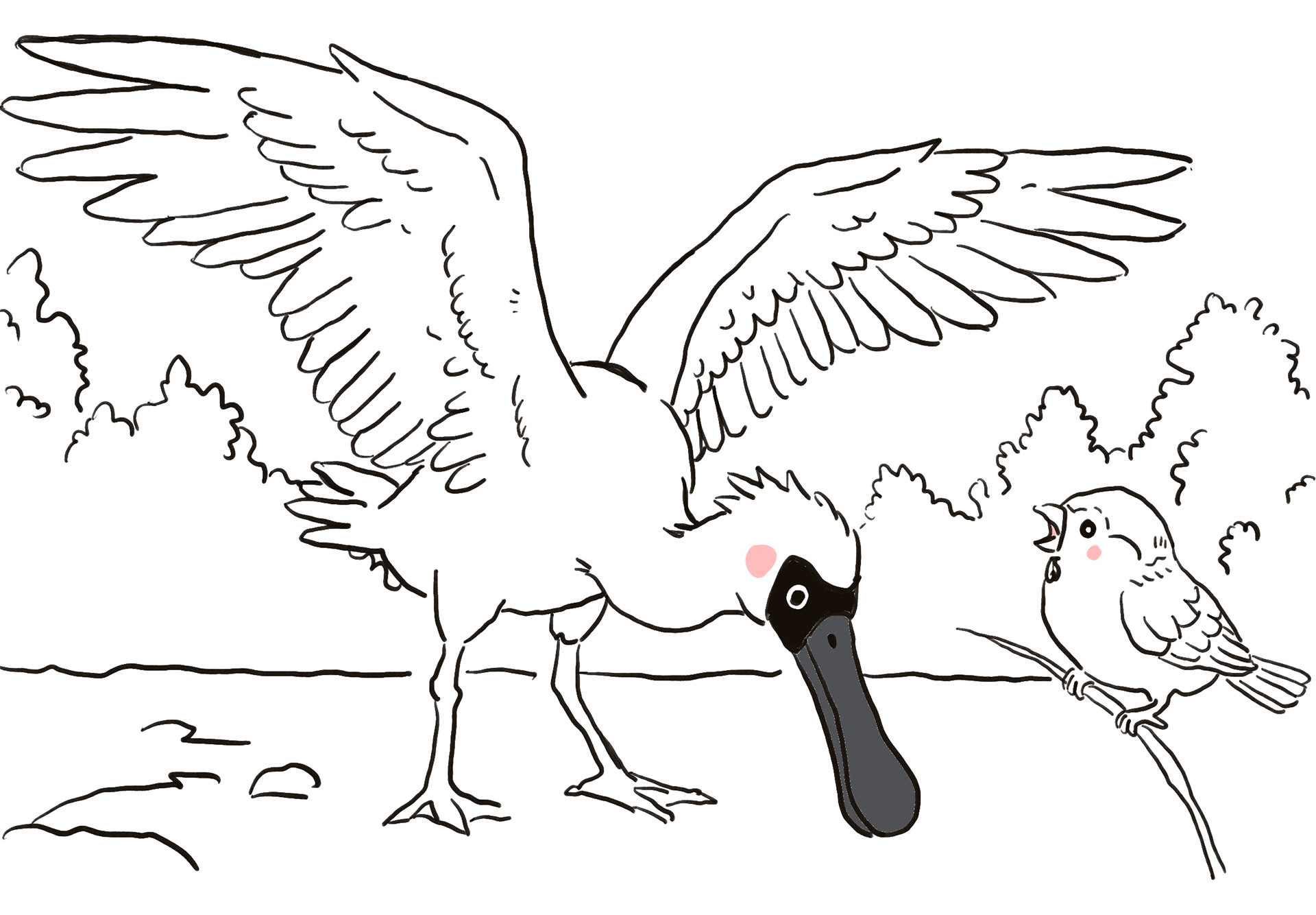
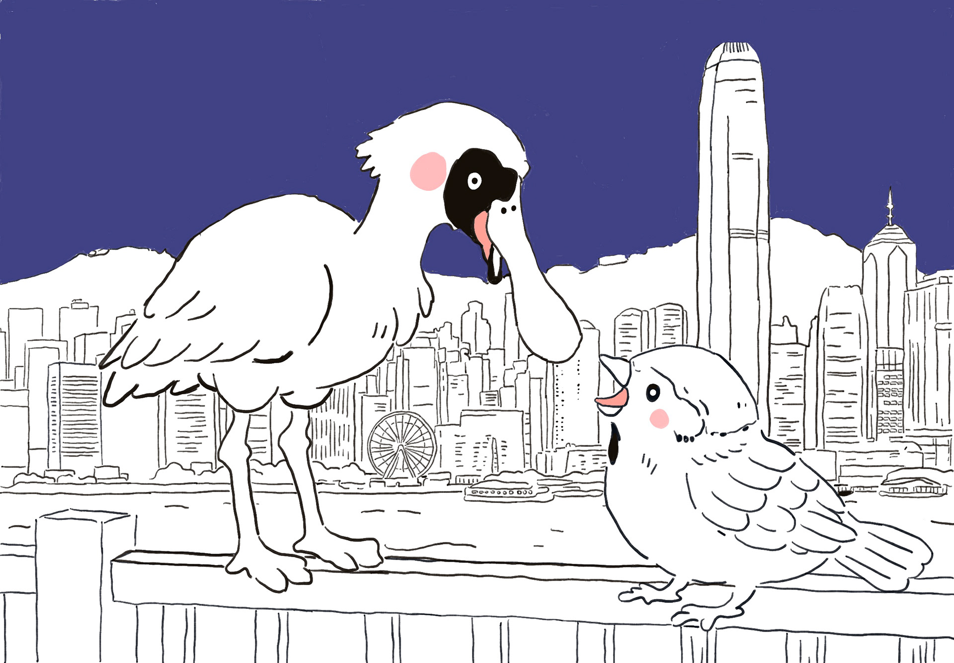
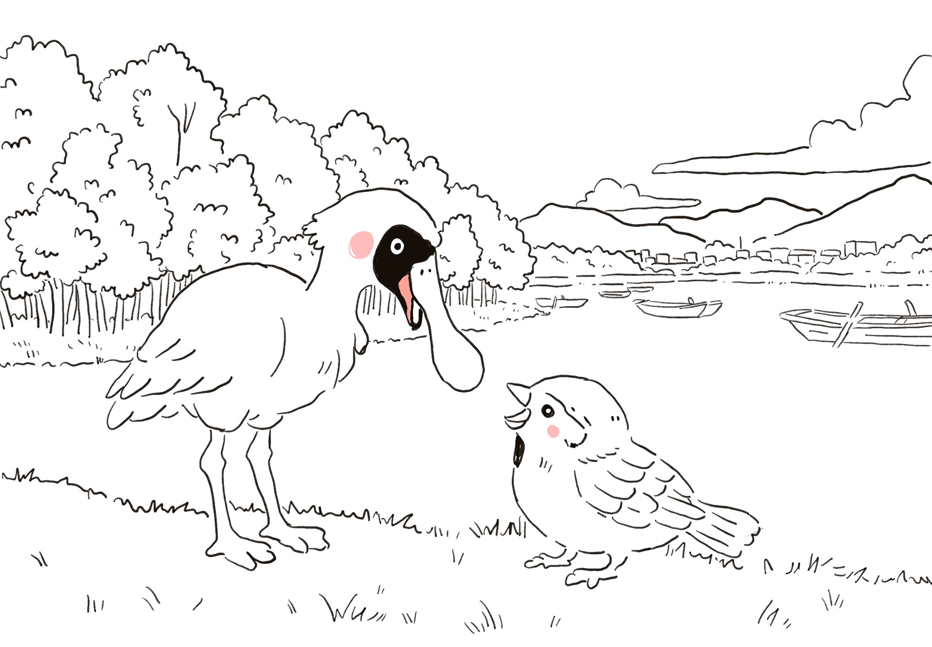
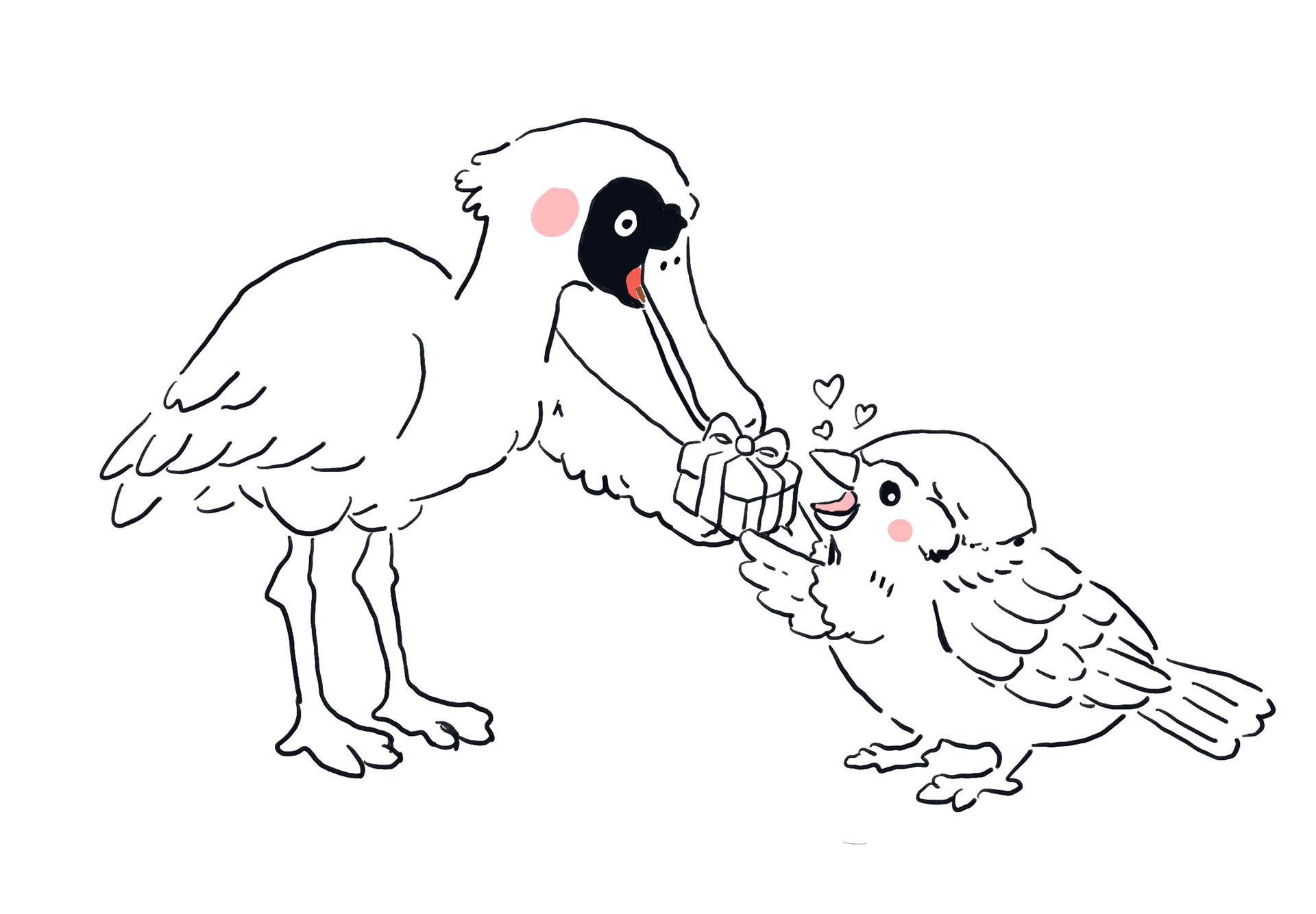
At first, I used the black-faced spoonbill to represent a traveller who travels to Hong Kong because it is a migratory bird. I chose this bird because its migration journey reflected ideas of travelling, movement, and cultural transition, which connected closely to my project about the relationship between Hong Kong and the UK. The black-faced spoonbill symbolised people moving between different places while carrying their memories and identities with them.
I was particularly interested in how migratory birds naturally cross borders and move between environments, which felt similar to the experience of immigration and adapting to a new culture. The bird’s journey became a metaphor for emotional transition, loneliness, belonging, and the process of finding a home in unfamiliar places. Since my project explores my observations and experiences between Hong Kong and the UK, I wanted the black-faced spoonbill to reflect the feeling of existing between two cultures and constantly moving between memories of different places.
Visually, I was also drawn to the elegant shape and quiet atmosphere of the bird. Its long migration journey suggested endurance and resilience, while its temporary arrival in Hong Kong created a feeling of passing through rather than permanently staying. I felt this connected strongly to the emotional themes within my work, especially the idea of people searching for comfort, identity, and connection while living away from familiar surroundings.
Sparrow
Core traits
Street-smart – knows the city well
Friendly – used to people
Confident – not easily scared
Energetic – always moving
Curious in a practical way – not dreamy, more realistic
Sociable – likes being around others
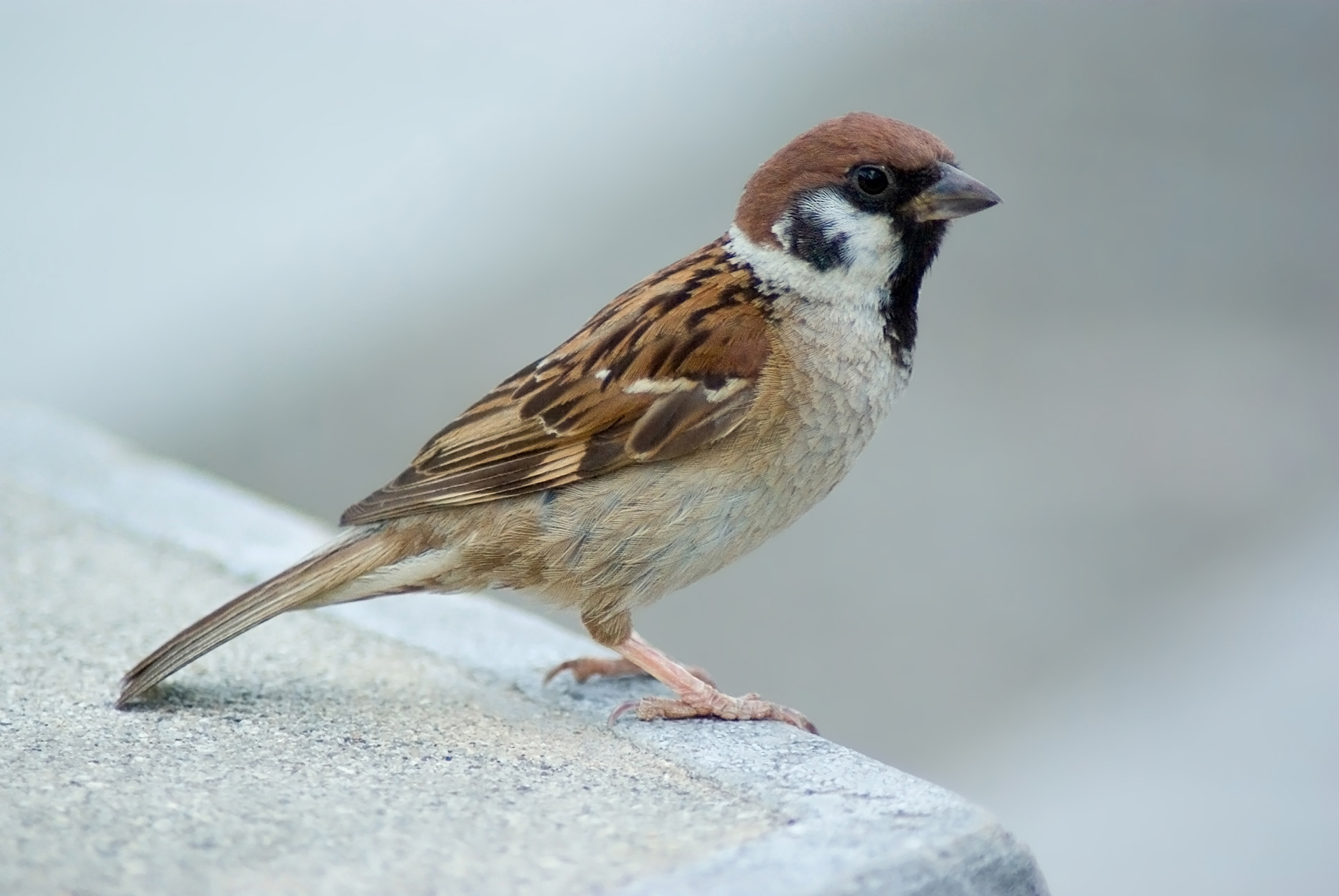
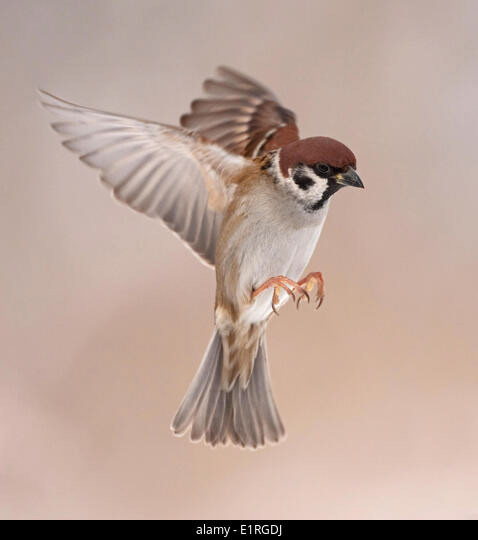
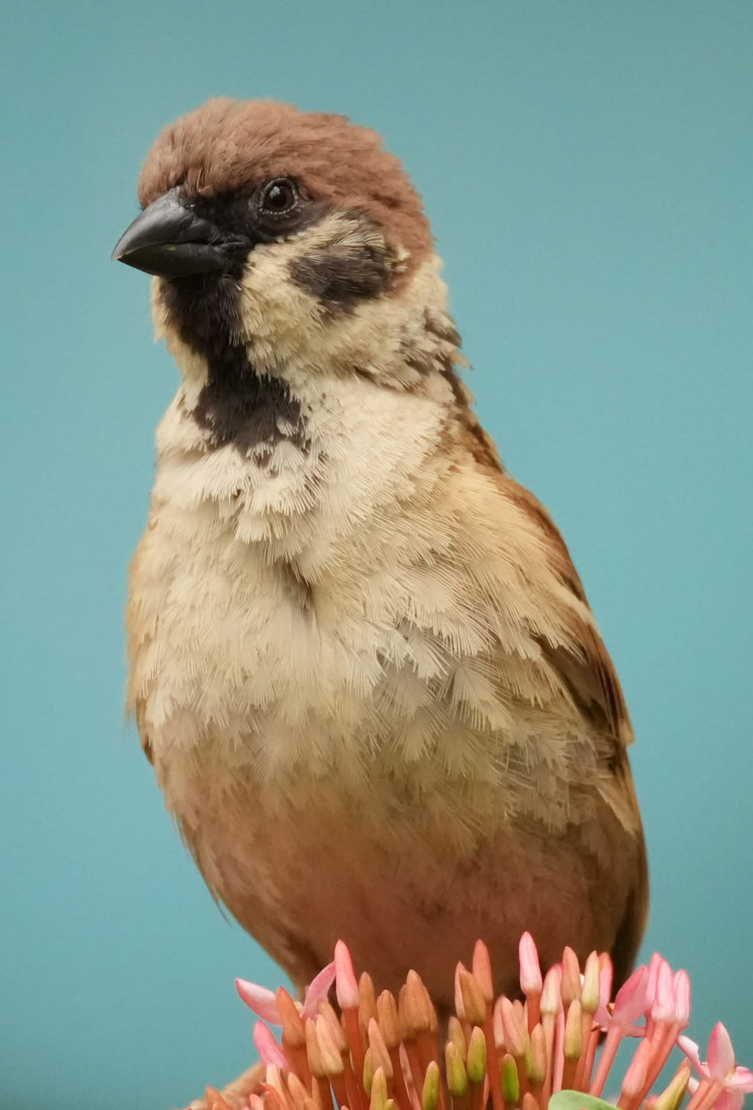
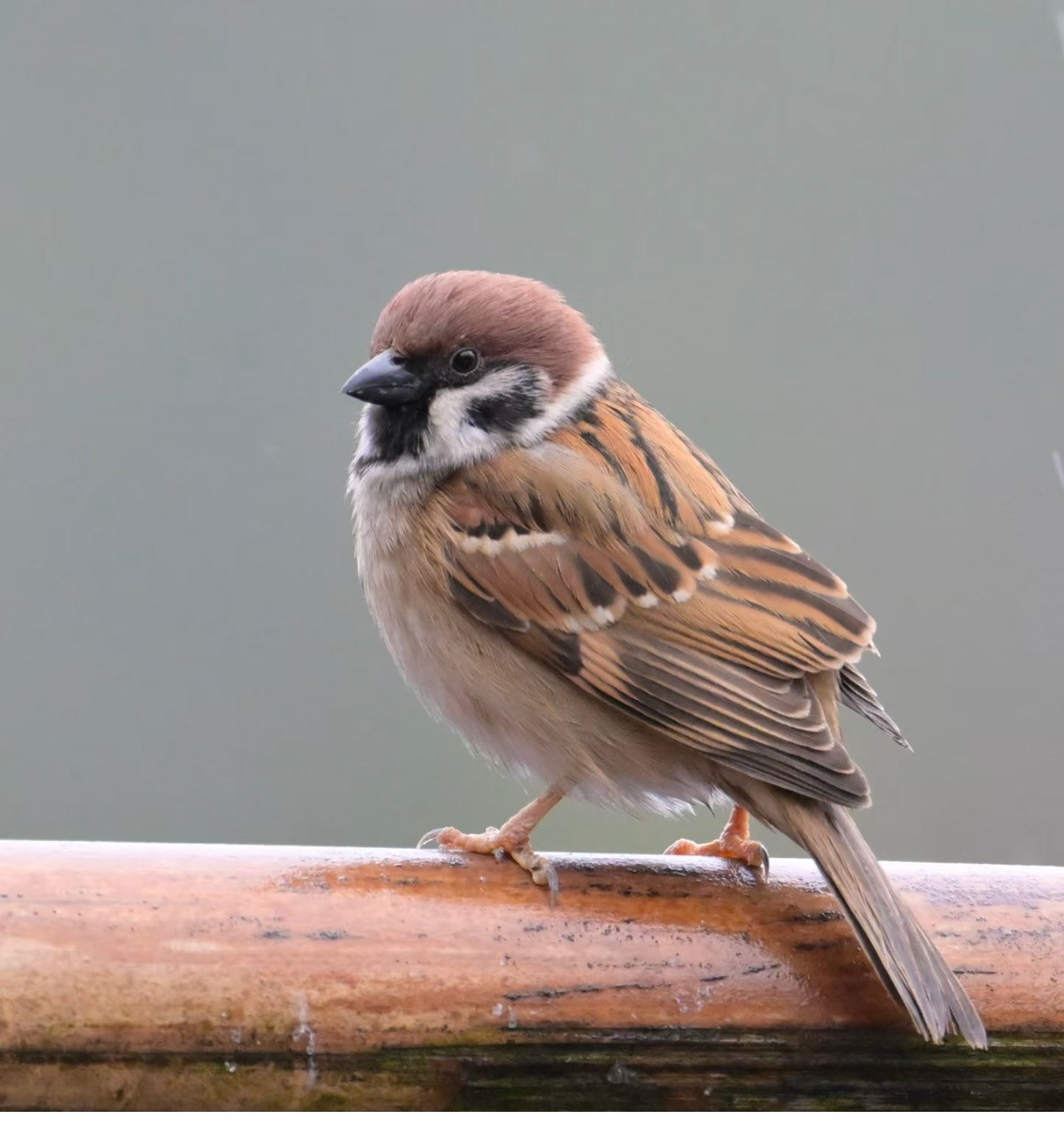
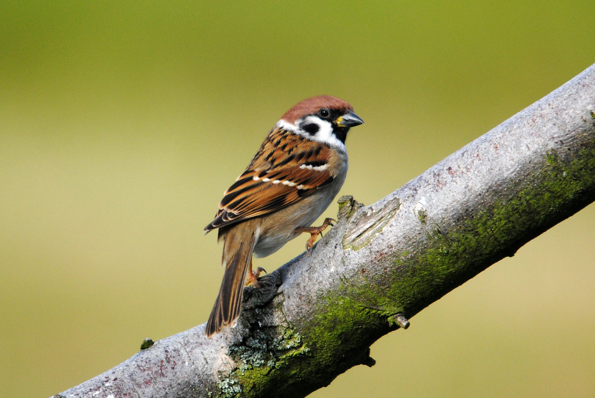
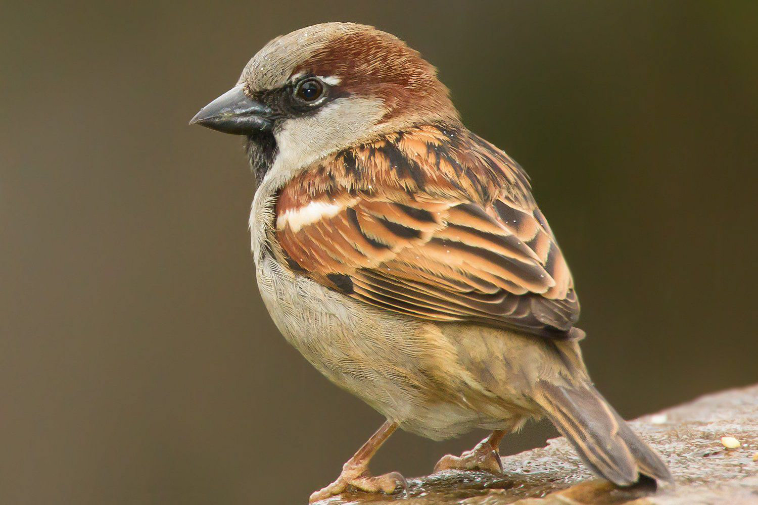
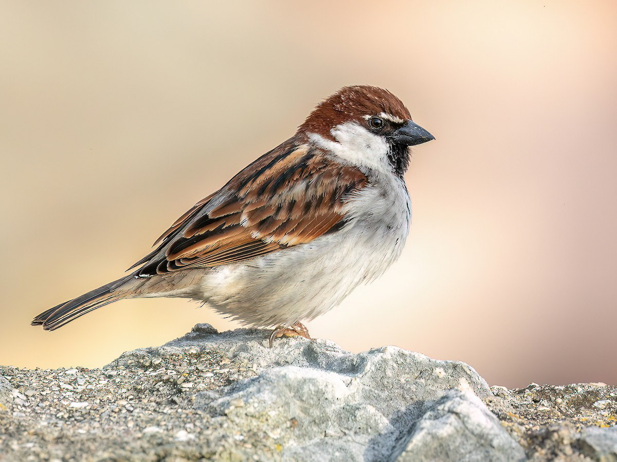
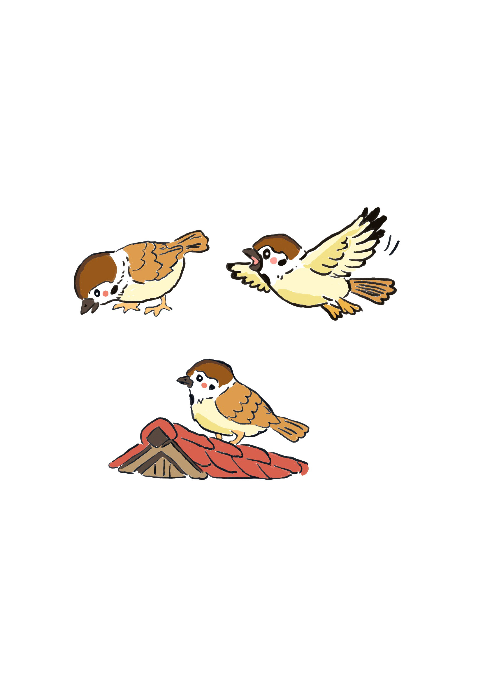
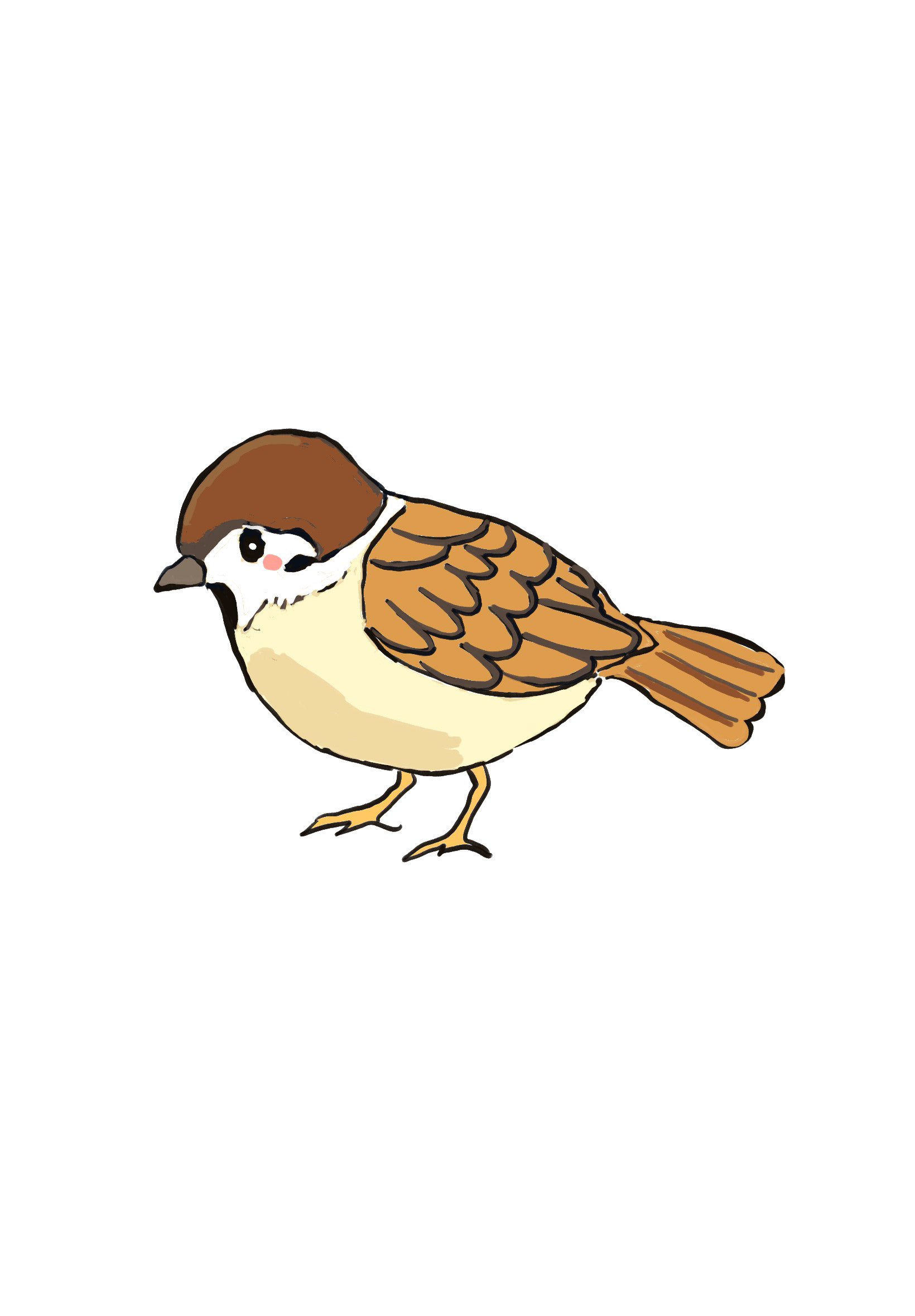
The sparrow in my project is a friendly and confident local bird who lives in Hong Kong. She is knowledgeable and curious, moving easily through the busy streets, markets, and rooftops of the city. Unlike the robin, she feels completely at home in the urban environment and enjoys sharing her world with others.
Her personality is warm, welcoming, and playful. She notices the robin’s shyness and gently encourages him to explore, guiding him through new experiences with patience and kindness. She is also observant, often pointing out small details of city life that the robin might otherwise miss, helping him feel connected and less overwhelmed.
Visually, the sparrow’s confidence and friendliness can be expressed through upright posture, lively movements, and expressive eyes. She might hop or flutter energetically, or tilt her head in an inviting way to show curiosity. Through her personality and actions, the sparrow becomes a guide and companion for the robin, representing the warmth and familiarity of Hong Kong and helping the robin feel that new places can also be safe and welcomin
Picture book research
Sketches
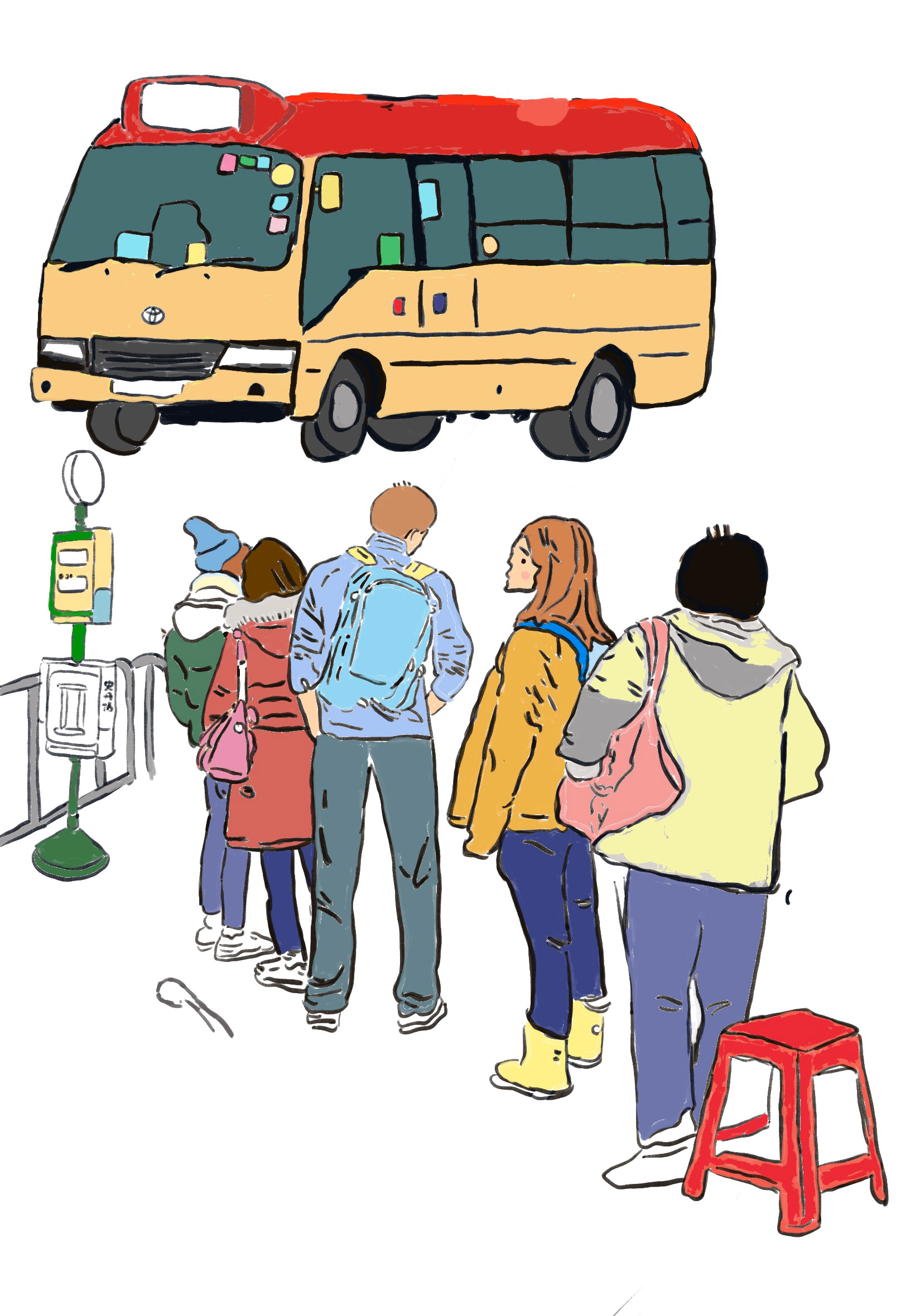
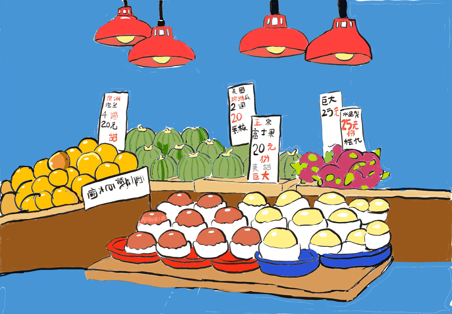
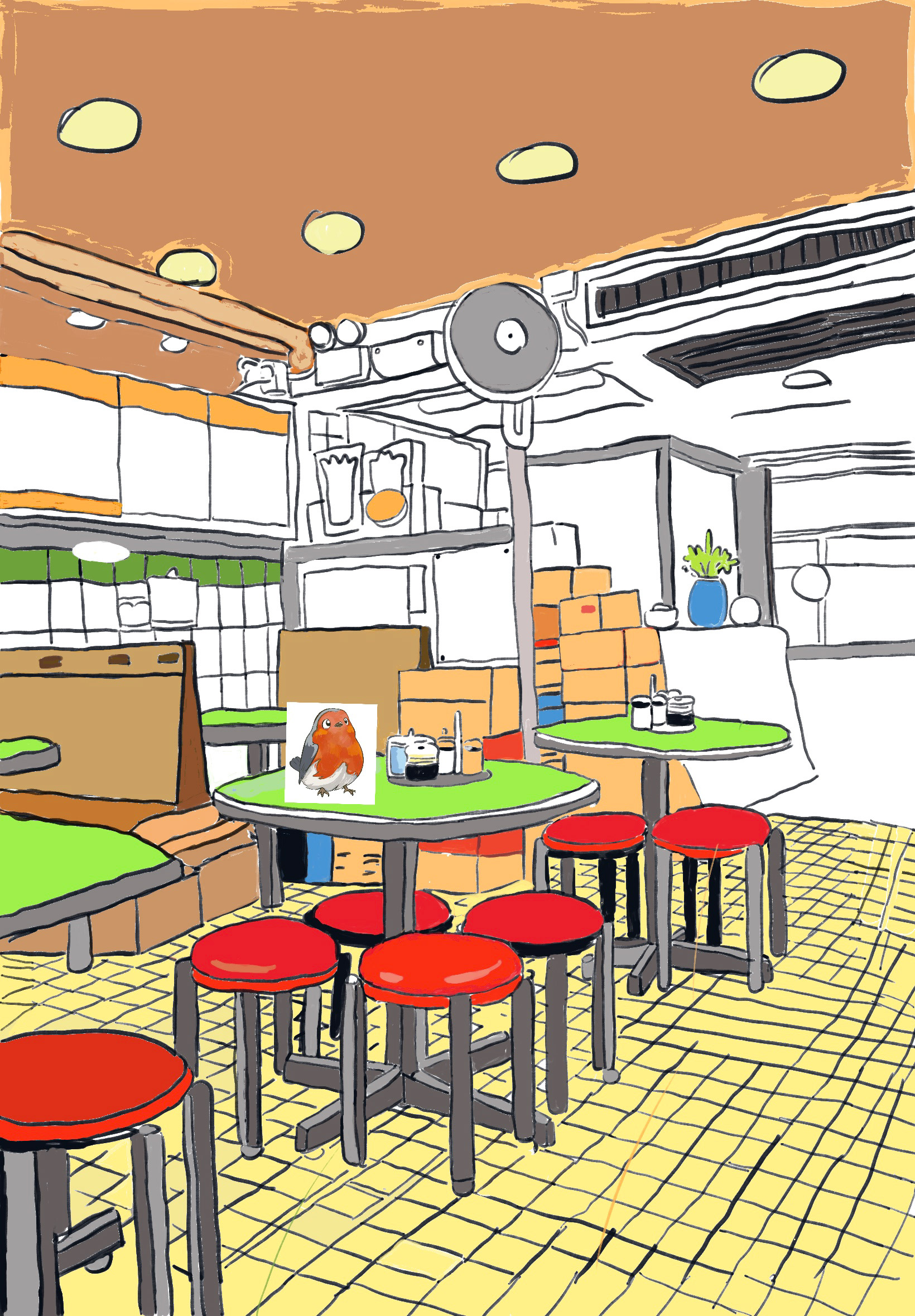
picture book Sketches
Hong Kong place Research
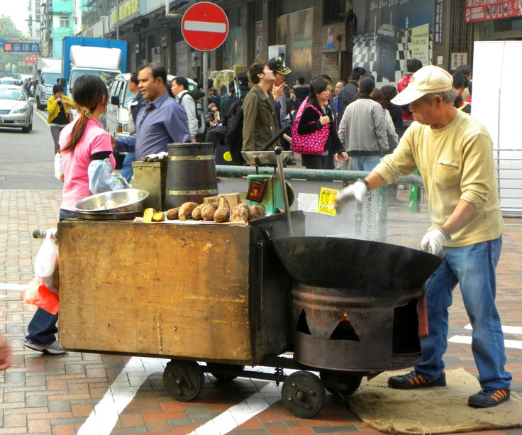
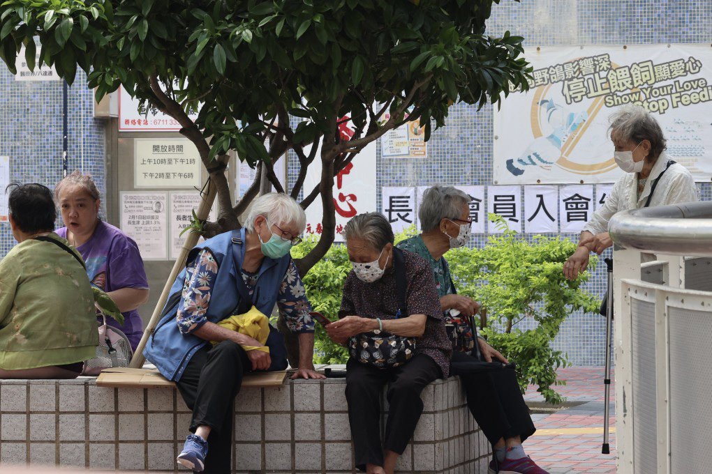
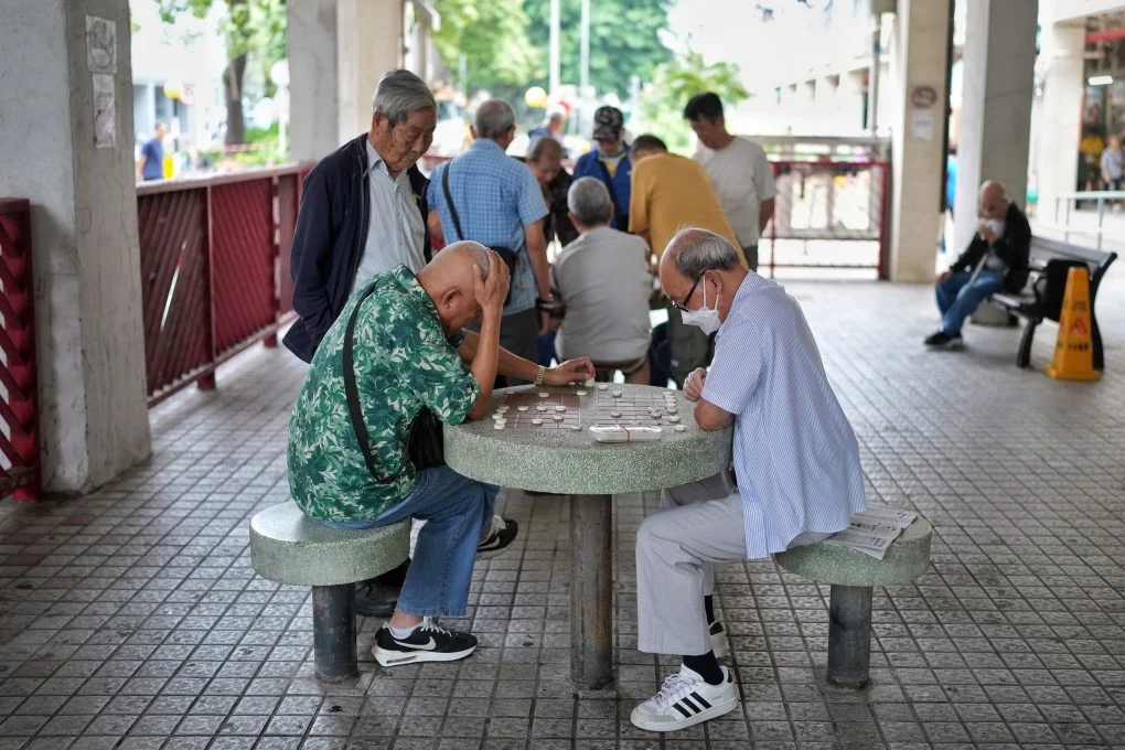
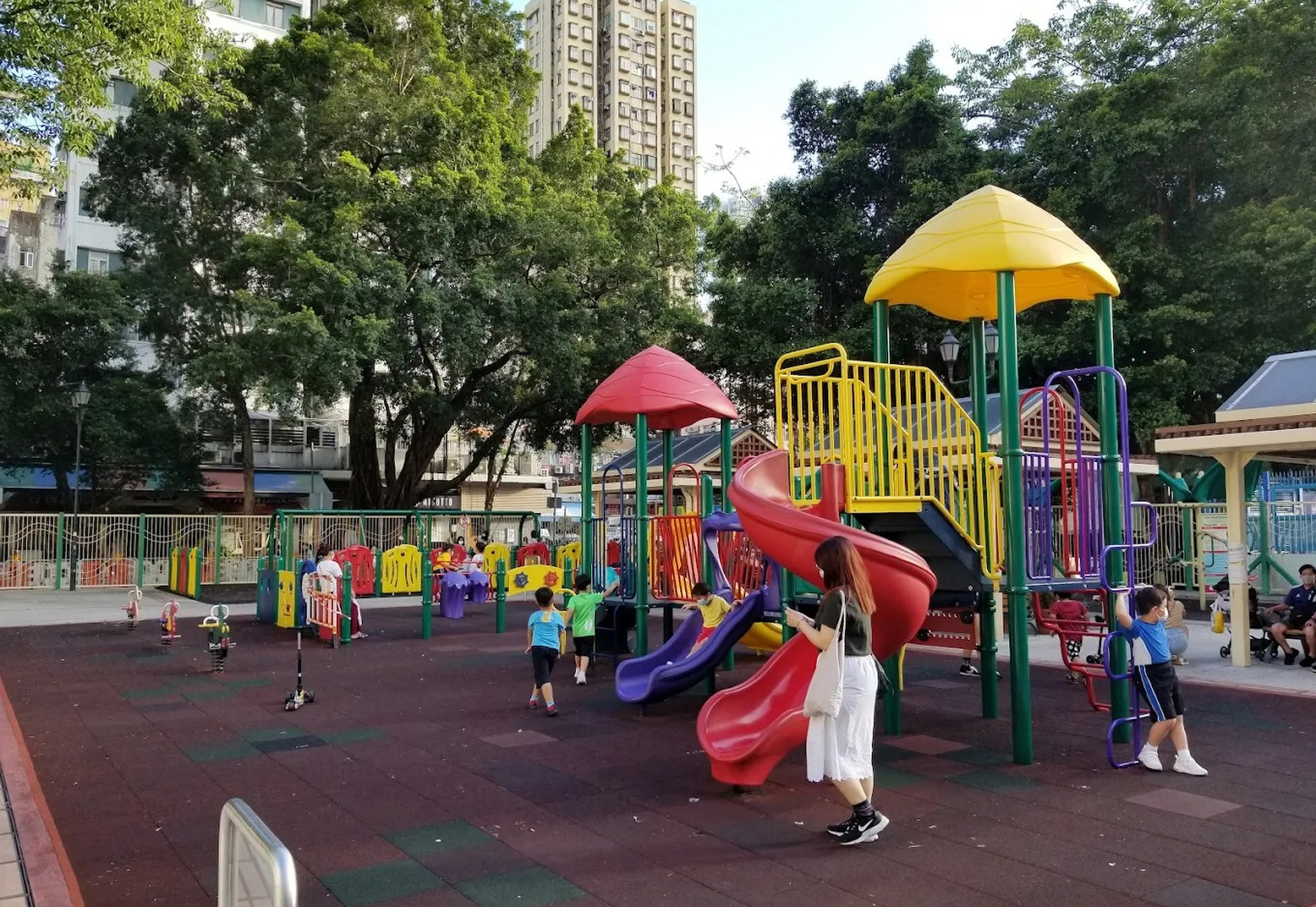



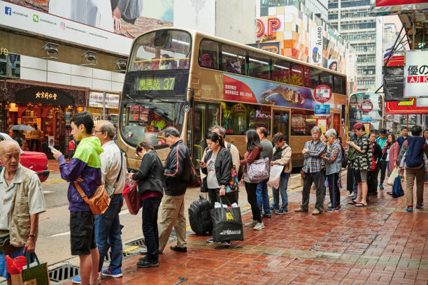
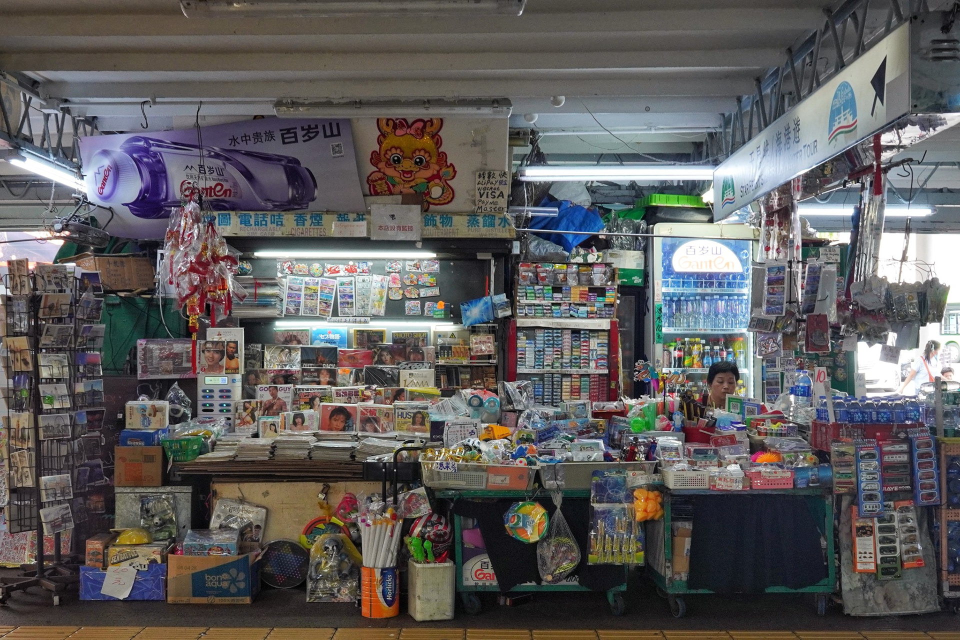
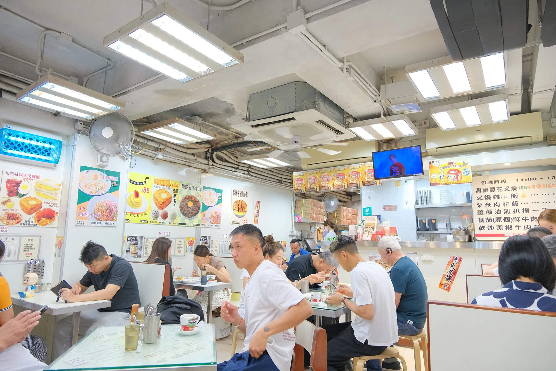
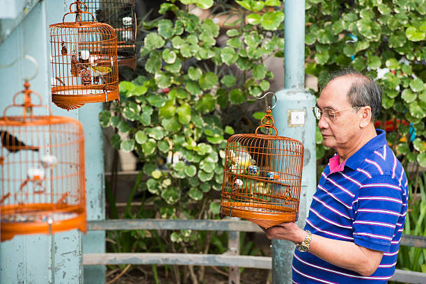
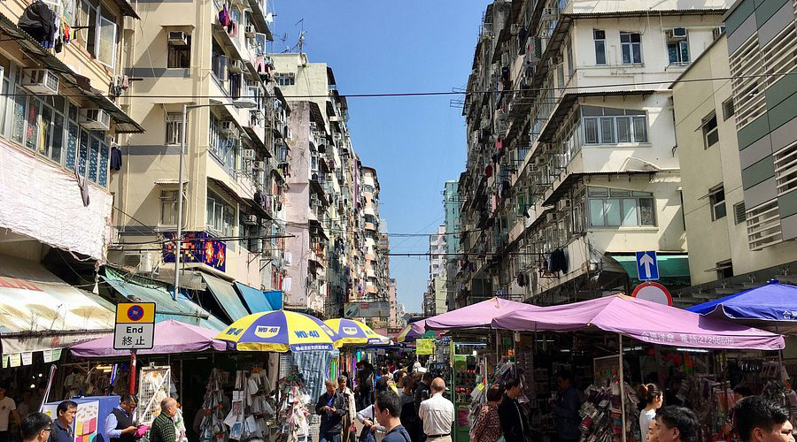
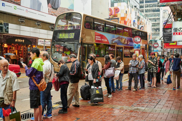
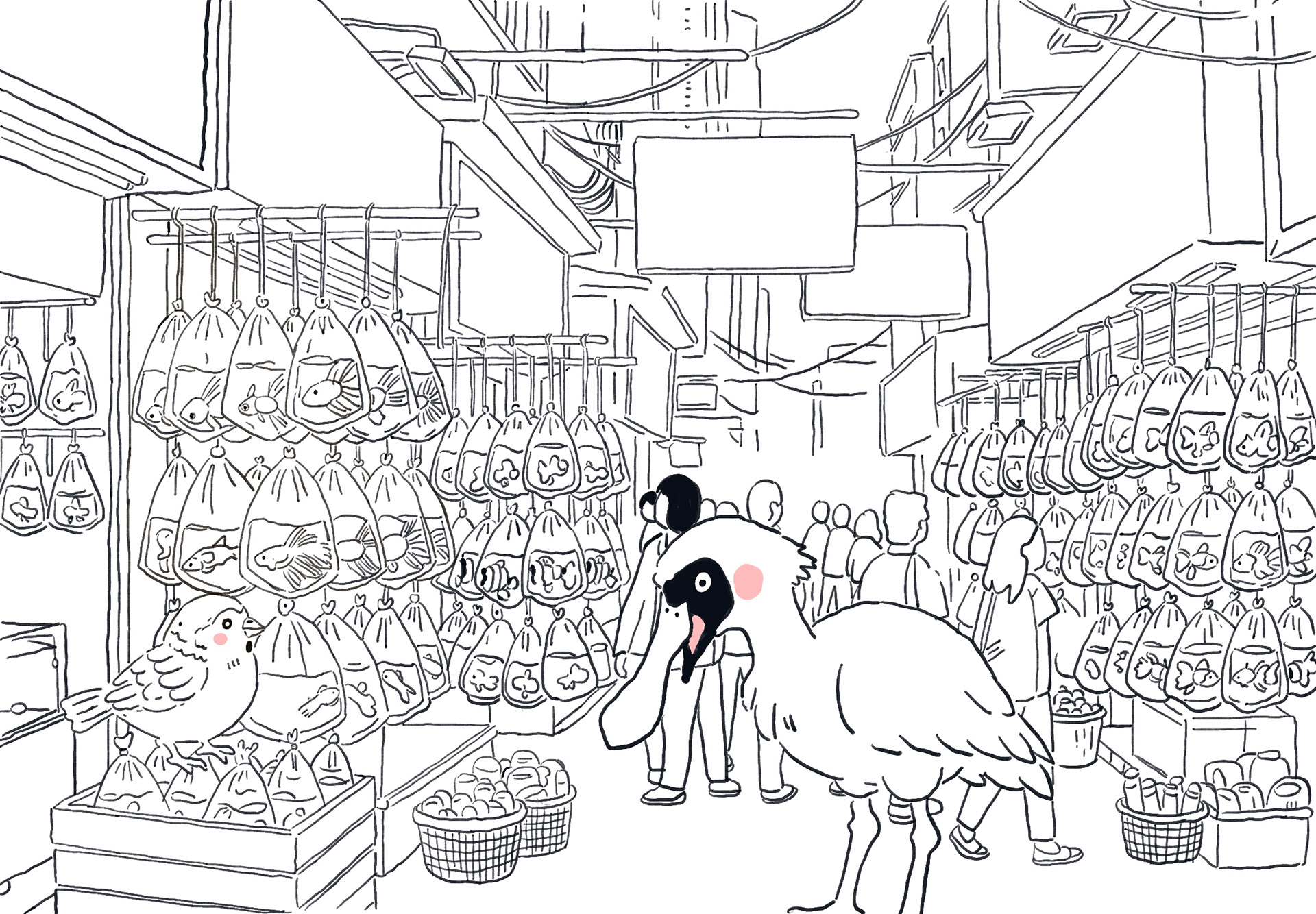
I collected a series of photographs of Hong Kong that are deeply connected to my childhood memories. These images capture familiar streets lined with high-rise apartment buildings, bustling wet markets filled with fresh produce and street snacks, quiet parks hidden between dense urban structures, and the small, everyday scenes that shaped my early life.
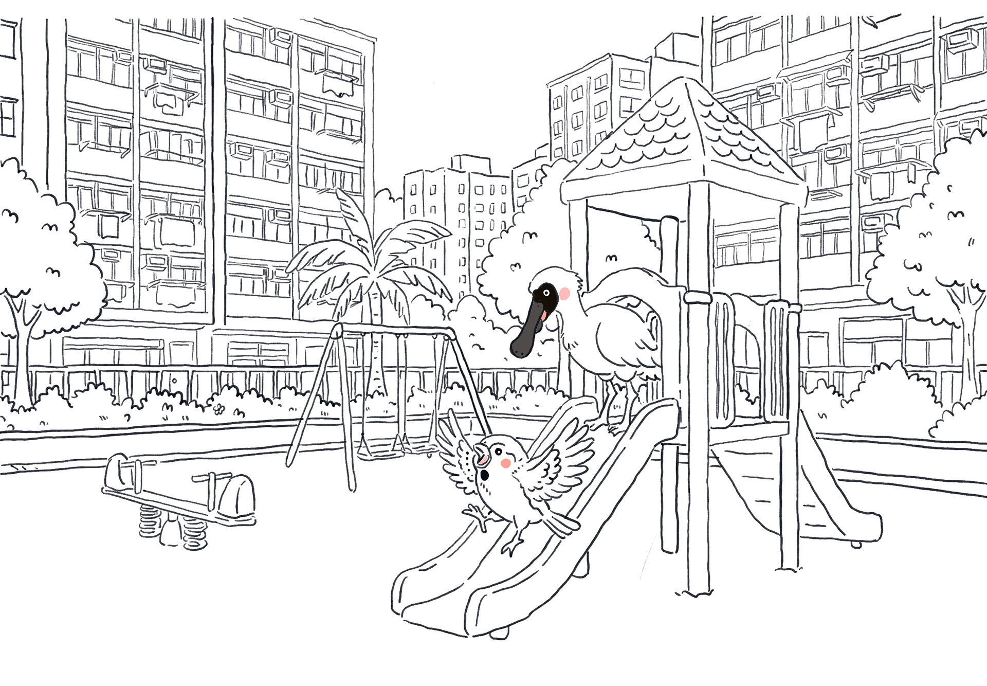
Looking at these photographs evokes not only visual recollection, but also a strong sensory response. I am reminded of the warmth of the winter sun on my skin, the smell of street food in the evening air, and the constant rhythm of people moving through narrow streets. I recall the subtle details that define these environments—the stickers on shop windows, the layered and colourful signage, the sound of trams passing through the city, and the lively energy of children playing in public housing estate playgrounds.
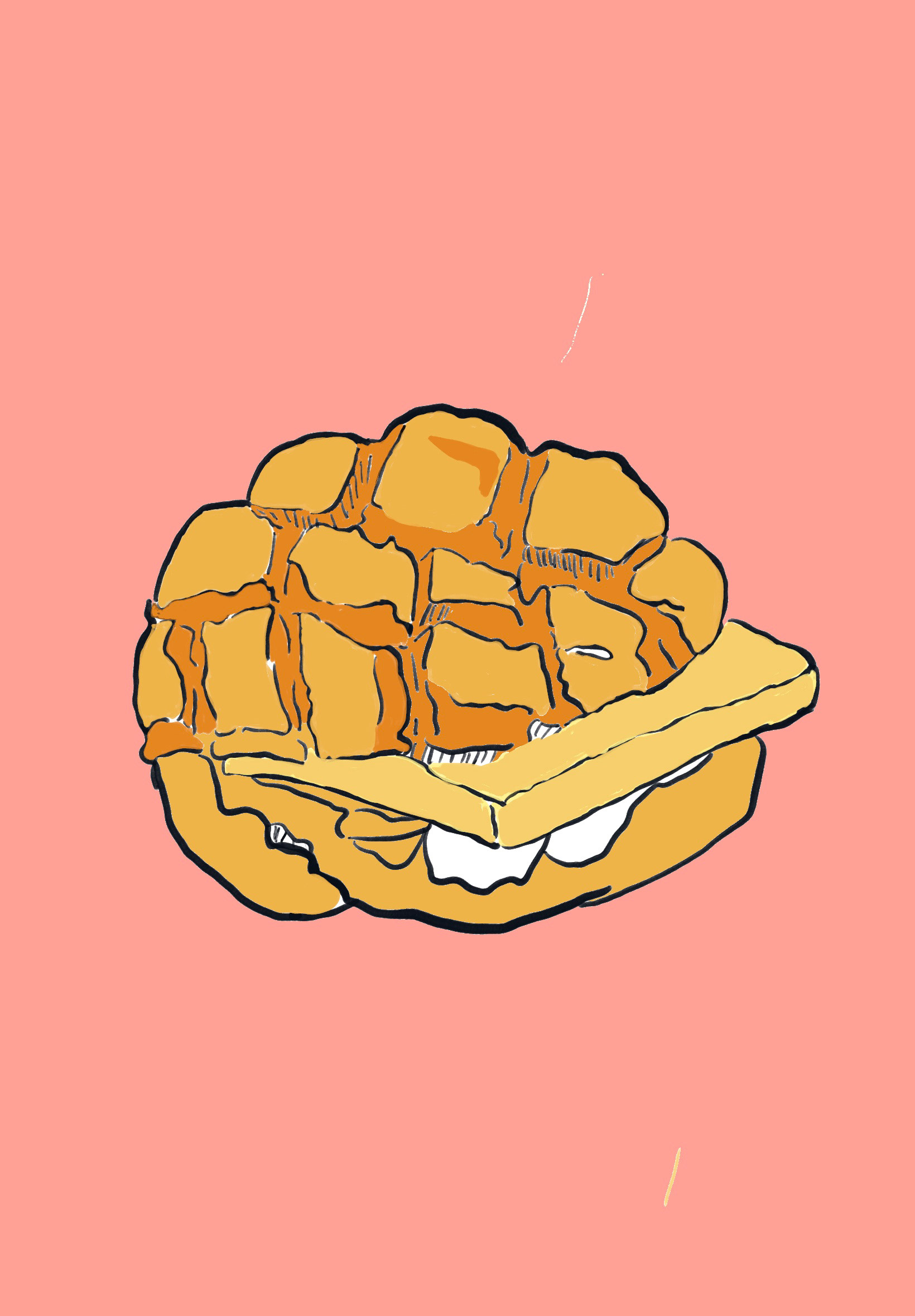
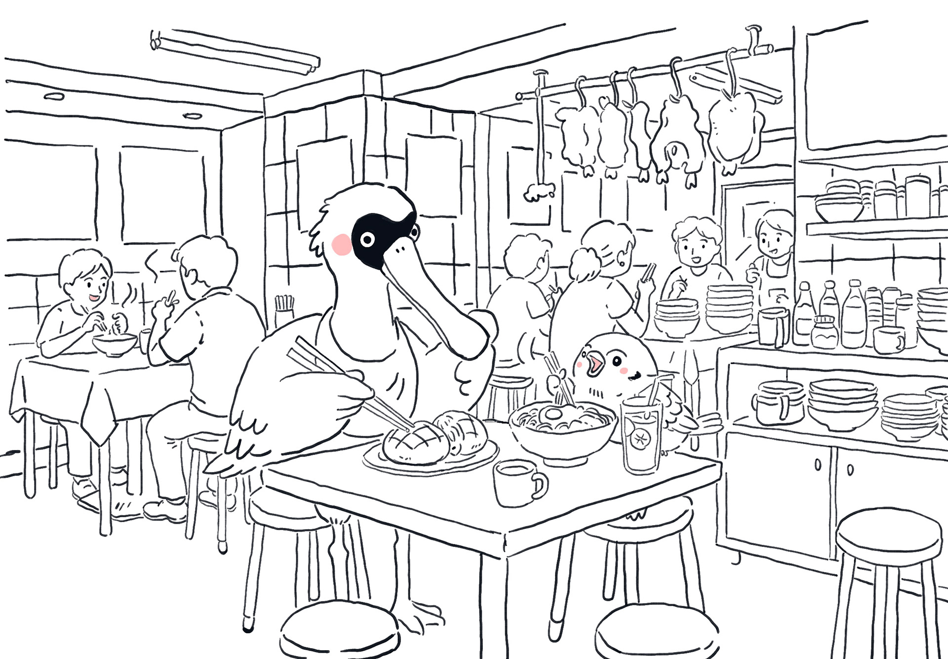
In particular, I am drawn to moments of everyday social interaction. Scenes such as elderly people playing chess in public parks, individuals gathering to chat with friends while sharing their pet birds, and groups of people sitting together in cha chaan tengs eating egg tarts, pineapple buns, and drinking milk tea all reflect a strong sense of community. These moments, although seemingly ordinary, embody the social rhythms and cultural practices that define Hong Kong as a lived environment.
These memories extend beyond visual documentation; they carry emotional weight, including feelings of comfort, curiosity, and belonging. They reflect a sense of community that was embedded in my daily experiences as a child. The city, in my memory, is not defined by iconic landmarks, but by its atmosphere—where every corner feels active and interconnected, and where even the most ordinary moments possess a unique vibrancy.
Reflecting on these photographs allows me to maintain a personal connection to my hometown while also critically examining how these experiences have shaped my understanding of place. Through this process, I began to recognise that place is constructed through accumulated sensory impressions, emotional associations, and repeated everyday encounters. Revisiting these memories also allows me to capture a sense of nostalgia and warmth, while acknowledging the distance between past and present.
As a result, these photographic references became an important starting point in my visual development, enabling me to translate personal memory into a more interpretive and expressive visual language. Rather than reproducing these scenes directly, I began to explore how their atmosphere, rhythm, and emotional tone could be reimagined through drawing, contributing to my broader exploration of place as something fluid, subjective, and continuously reconstructed
Chungking Express
Non fiction Storybook Research
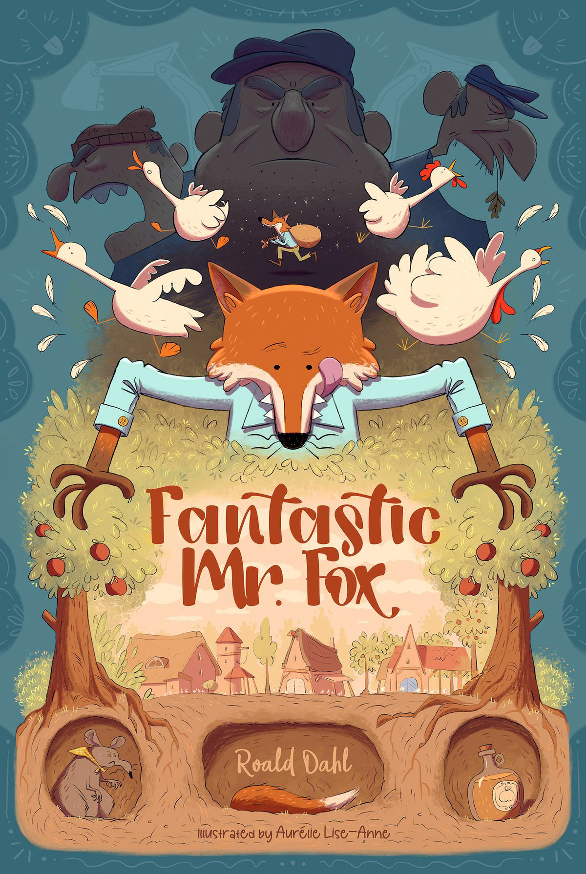
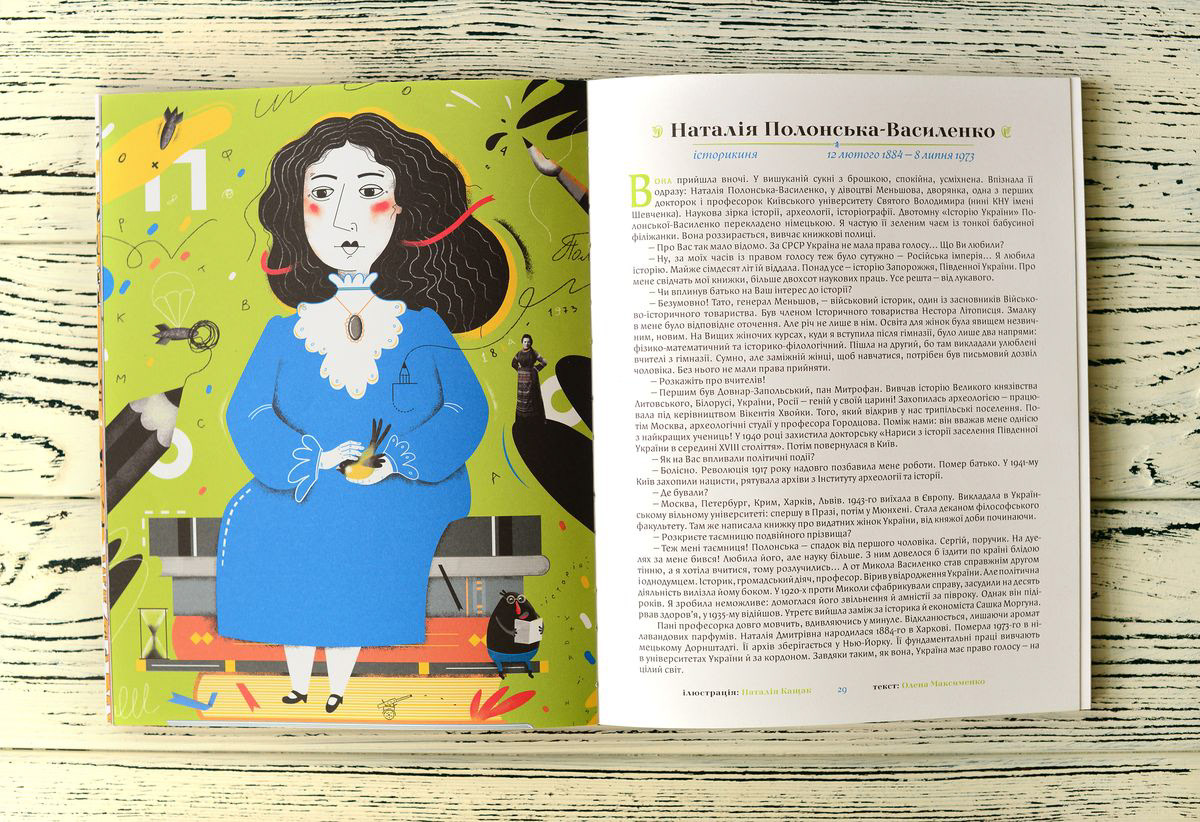
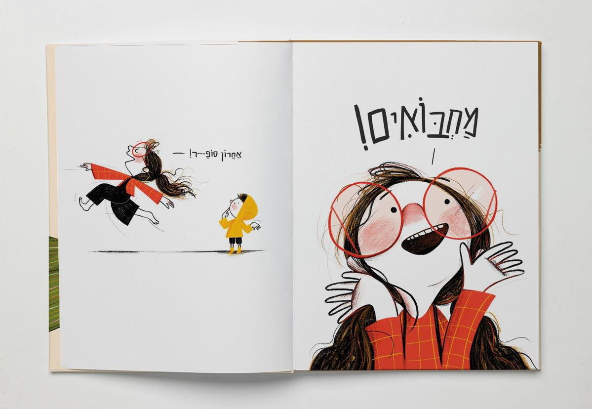
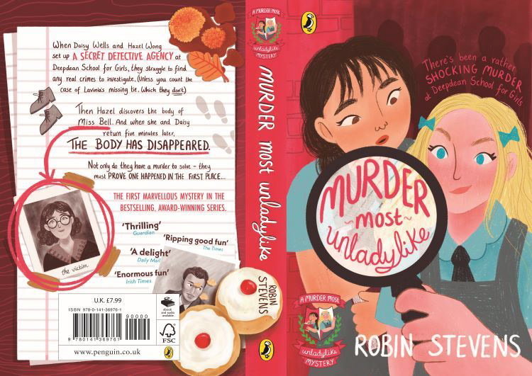
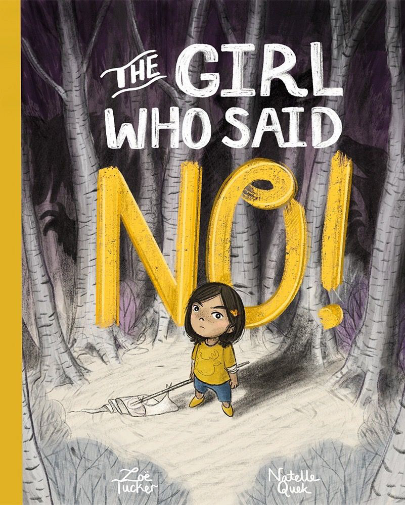
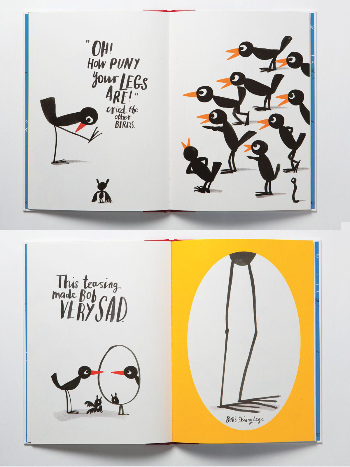
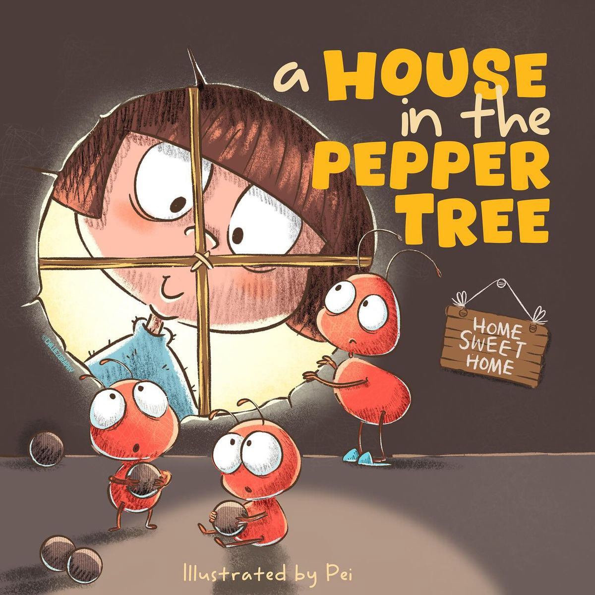
I started to explored a range of children’s picture books to inspire the visual and narrative style of my project. I paid close attention to how illustrators communicate emotions, character, and story through simple yet expressive imagery. Many of the books I looked at use playful colours, soft lines, and whimsical compositions that create a sense of warmth, wonder, and intimacy. I noticed how small details—like facial expressions, gestures, and environmental cues—can convey complex feelings without the need for lengthy text, which is especially useful for visual storytelling in a compact format.
Studying children’s books also helped me think about pacing and sequence. Just as picture books guide readers through a story step by step, I realized I could use similar techniques to present my own memories and experiences in a way that feels gentle, approachable, and immersive. The combination of lighthearted illustration and subtle emotional depth showed me how to balance playfulness with reflection. Overall, this research encouraged me to adopt a childlike curiosity and sensitivity in my work, helping me create visuals that are both personal and relatable, capturing small moments that carry emotional weight.
Prints of series 1 Draft
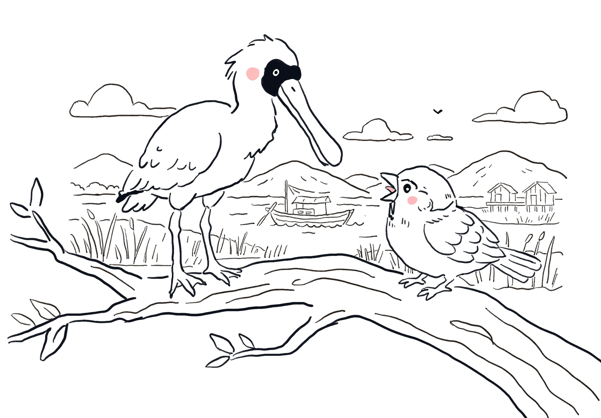
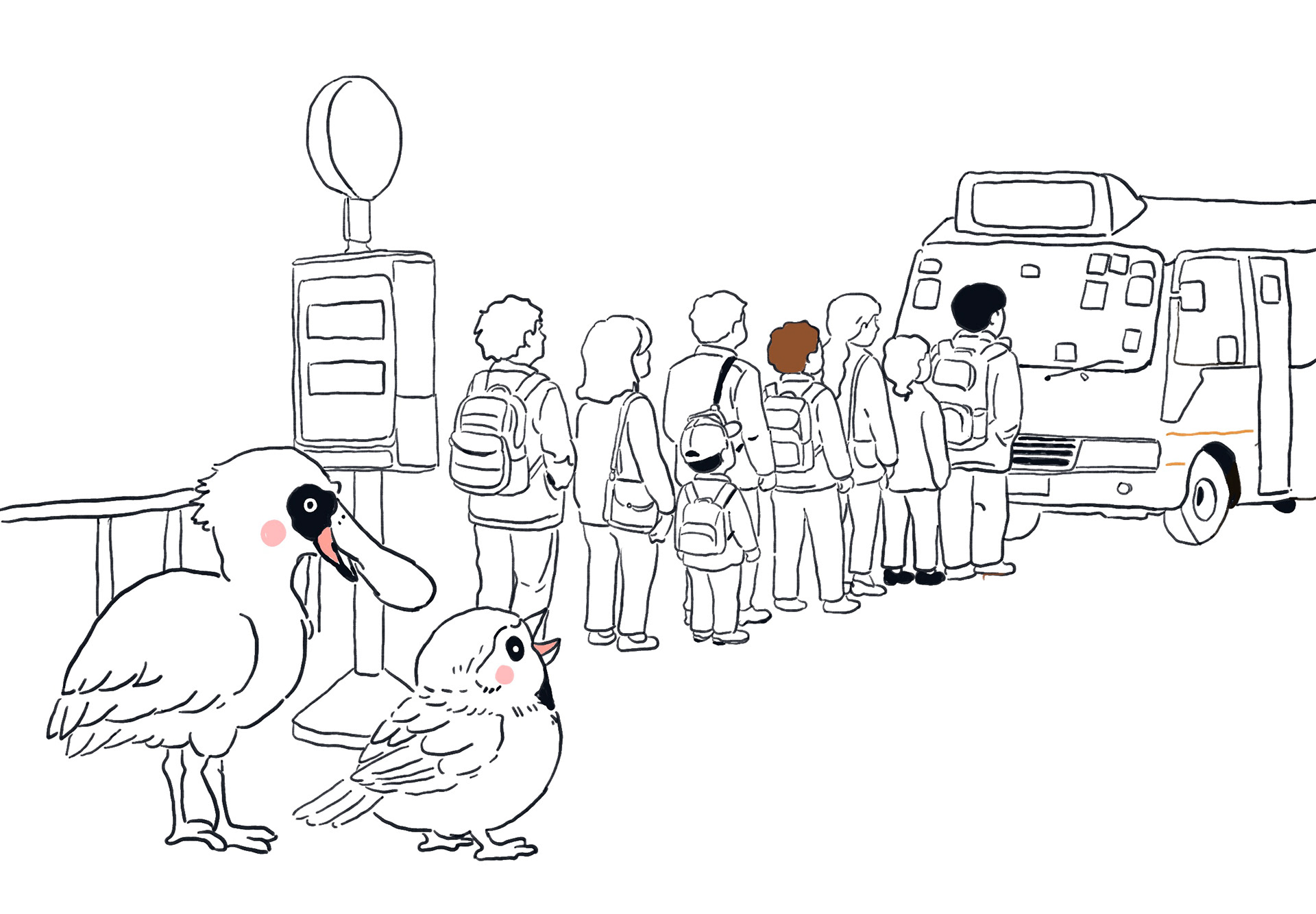
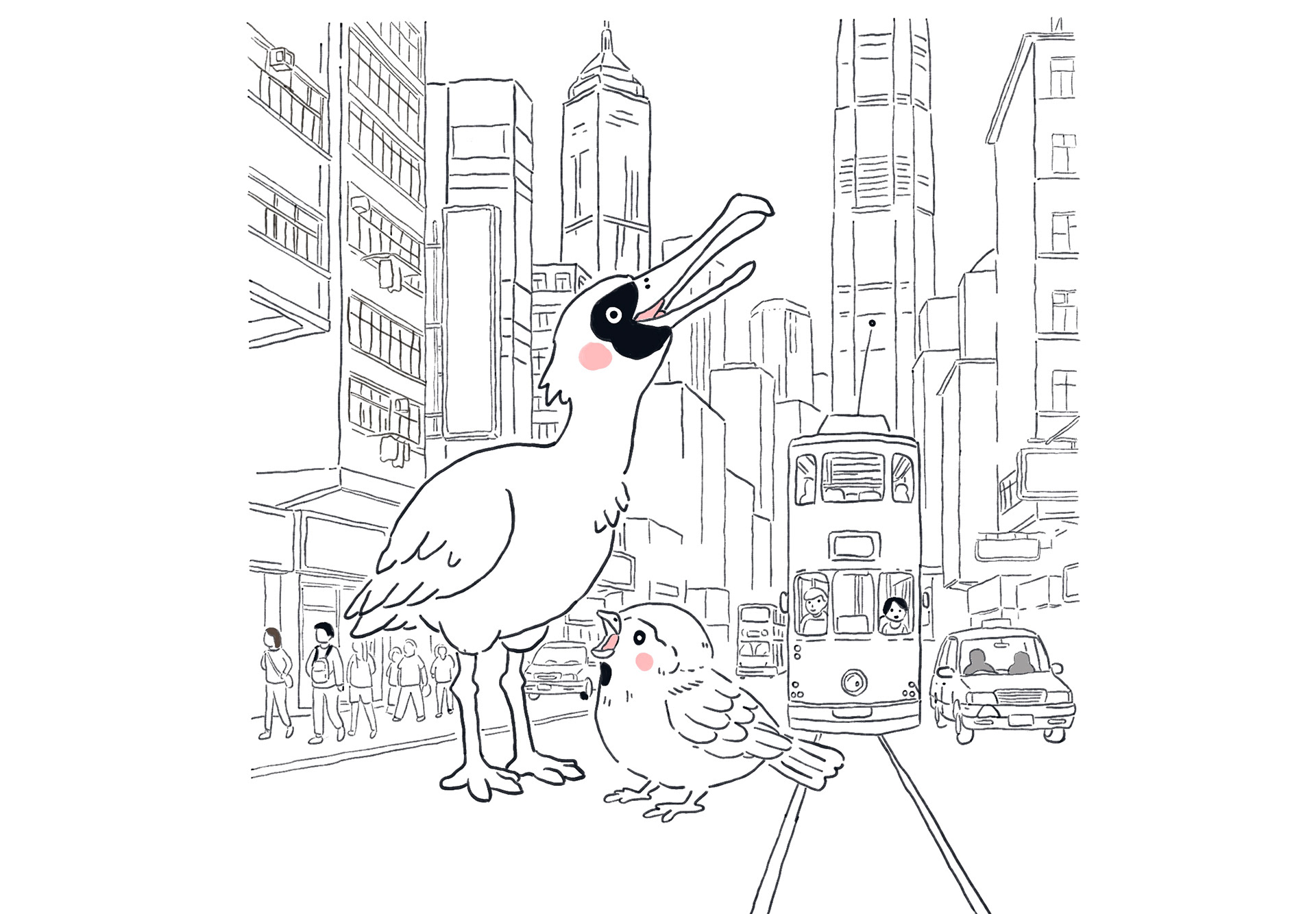
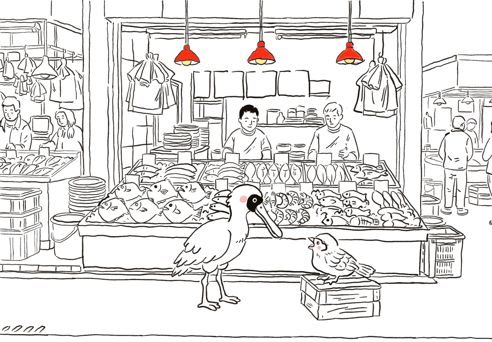
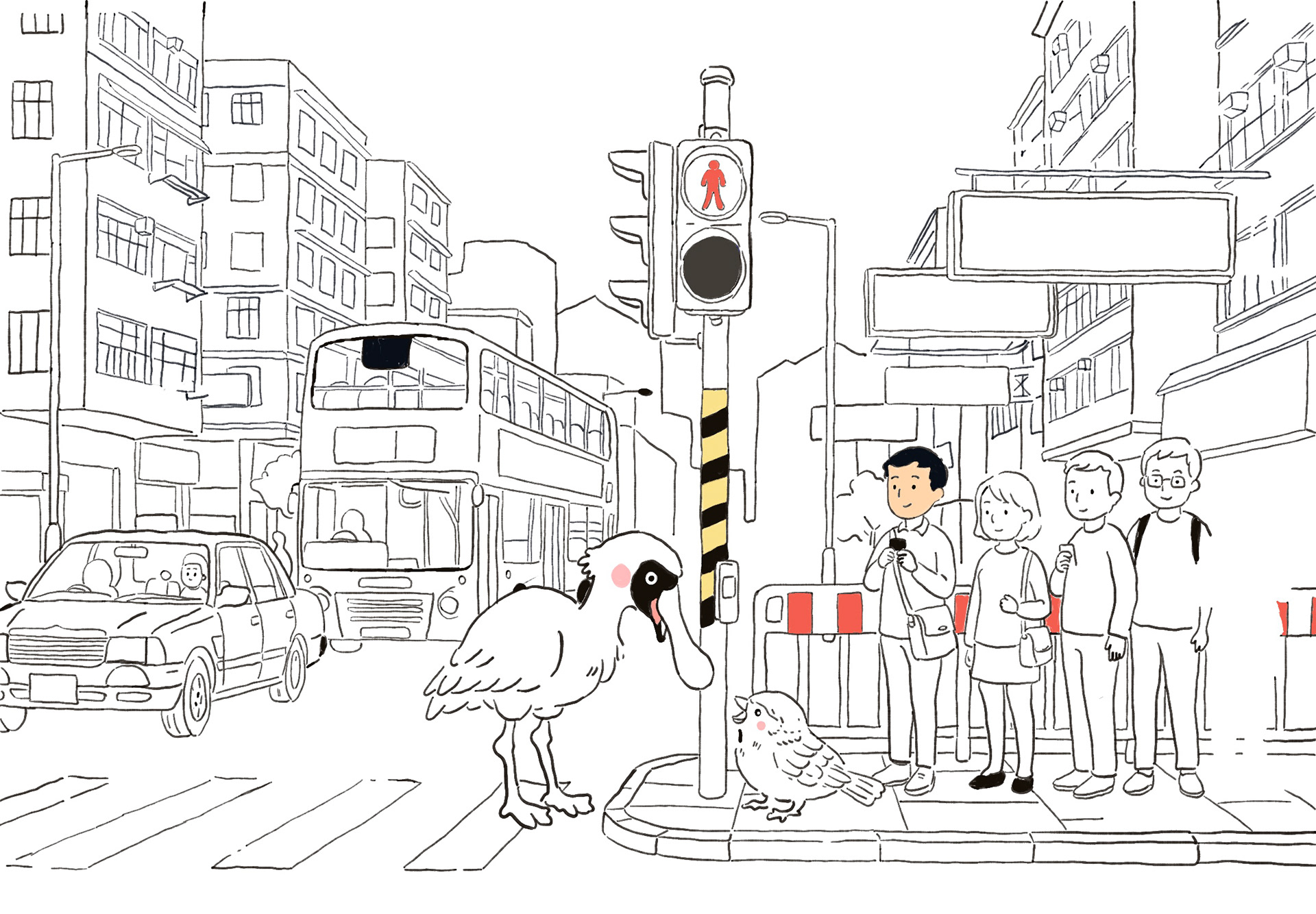
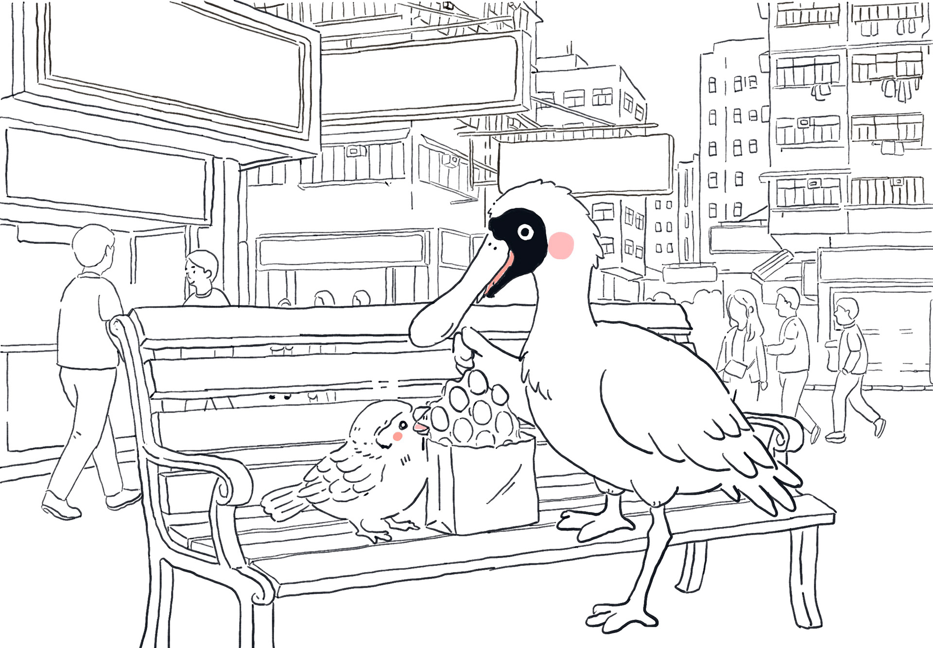
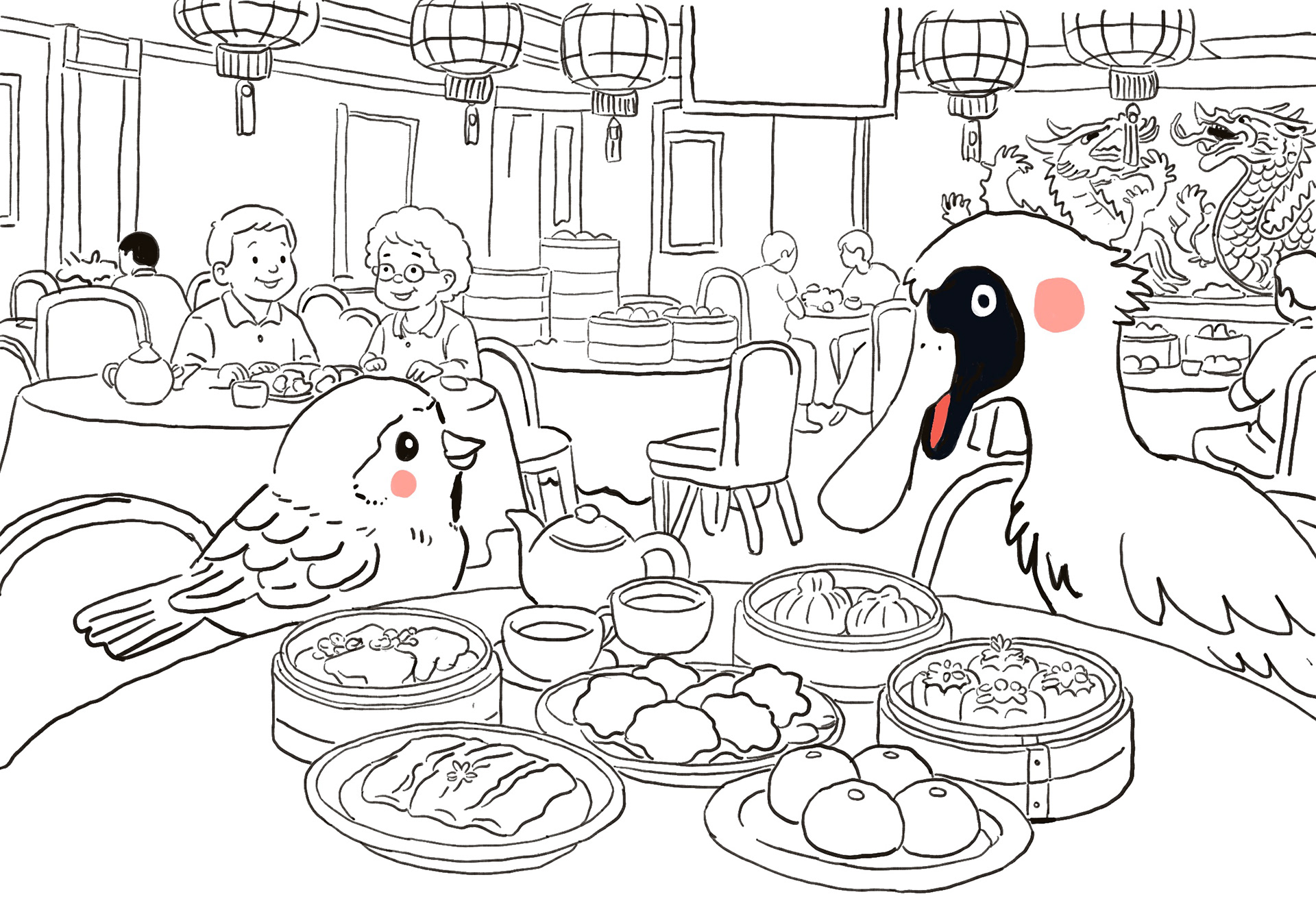
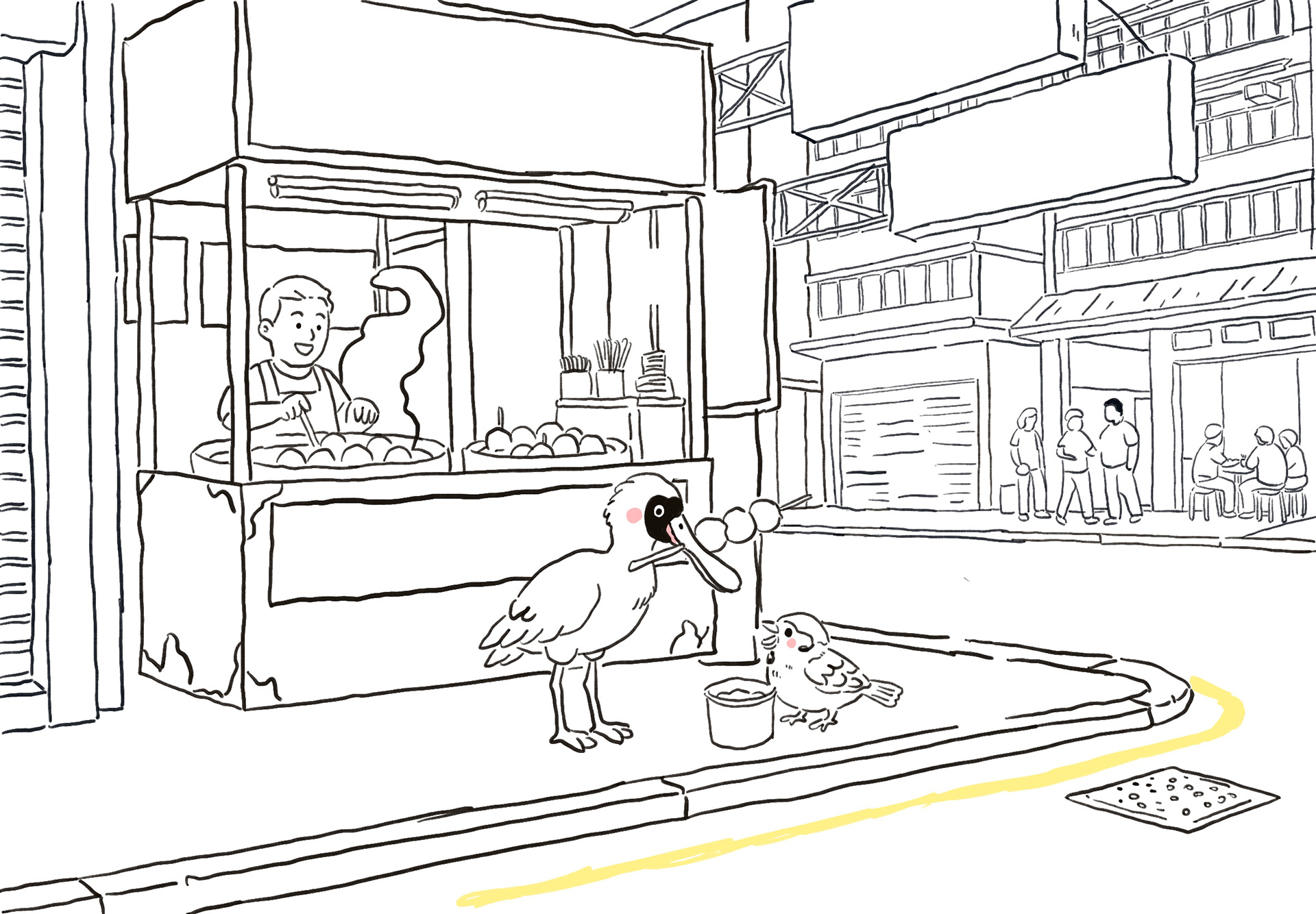
Character Design change
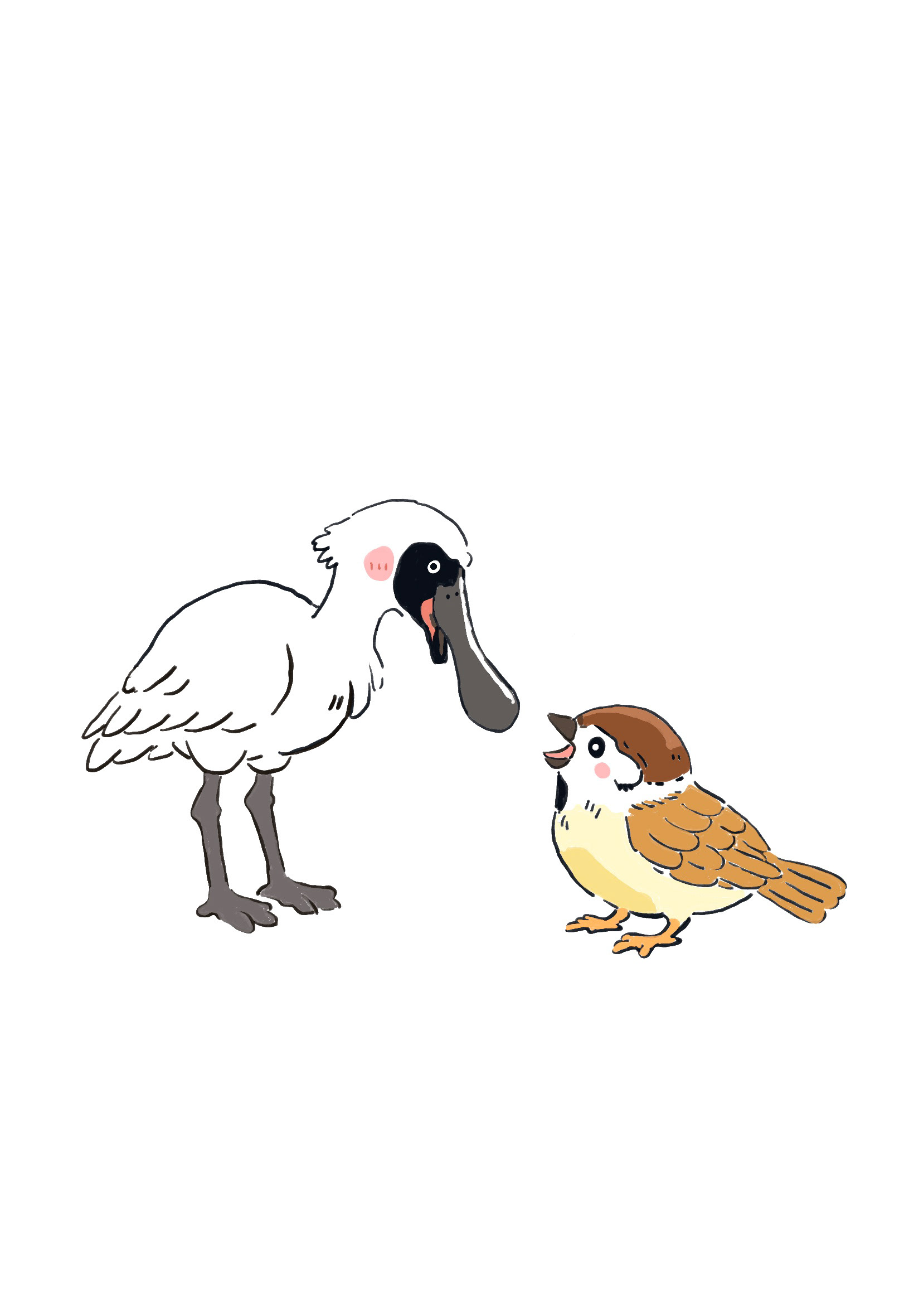
However, during the tutorial discussion with my teacher, I realised that many audience members were unfamiliar with the black-faced spoonbill and could not immediately understand its symbolic meaning. Although the bird carried strong personal meaning for me, I found that the audience needed additional explanation before they could connect the bird to ideas of migration, travelling, and cultural transition. This made me reconsider how effectively the character communicated visually within the story.
Because my project focuses heavily on visual storytelling and emotional connection, I wanted the audience to understand the atmosphere and symbolism more naturally and intuitively. I began to realise that if viewers were too focused on identifying or understanding the bird itself, they might become distracted from the emotions and narrative within the story. As a result, I decided to simplify the symbolism by choosing birds that are more familiar and recognisable in everyday life.
Eventually, I changed the bird characters into a robin and a sparrow. Robins can be seen everywhere in the UK and are often associated with warmth, comfort, and ordinary British daily life. In contrast, sparrows can be seen everywhere in Hong Kong and are closely connected to the city’s streets and urban environment. By using these two common birds, I was able to create a clearer visual connection between Hong Kong and the UK while making the story easier for audiences to relate to emotionally.
This change also strengthened the accessibility of my illustrations. The robin and sparrow fit naturally within my soft and childlike visual style, helping the characters feel more approachable and expressive. Although I changed the birds, the original themes of migration, identity, belonging, and movement between cultures still remain at the centre of the project. Instead of relying on a less familiar symbolic bird, I used more recognisable everyday imagery to communicate similar emotions in a gentler and more immediate way.
Character Design Research
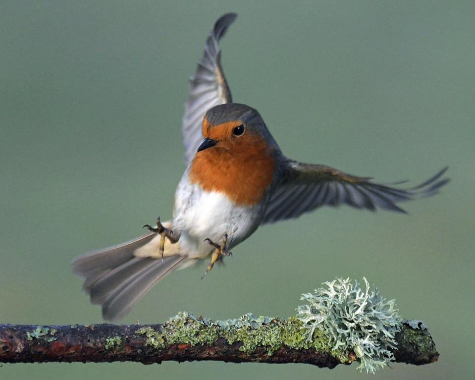
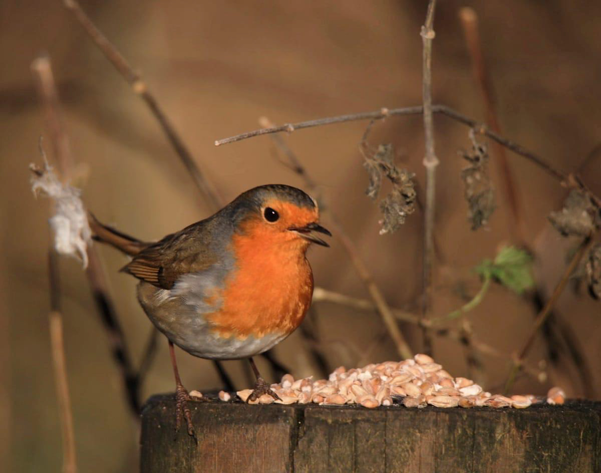
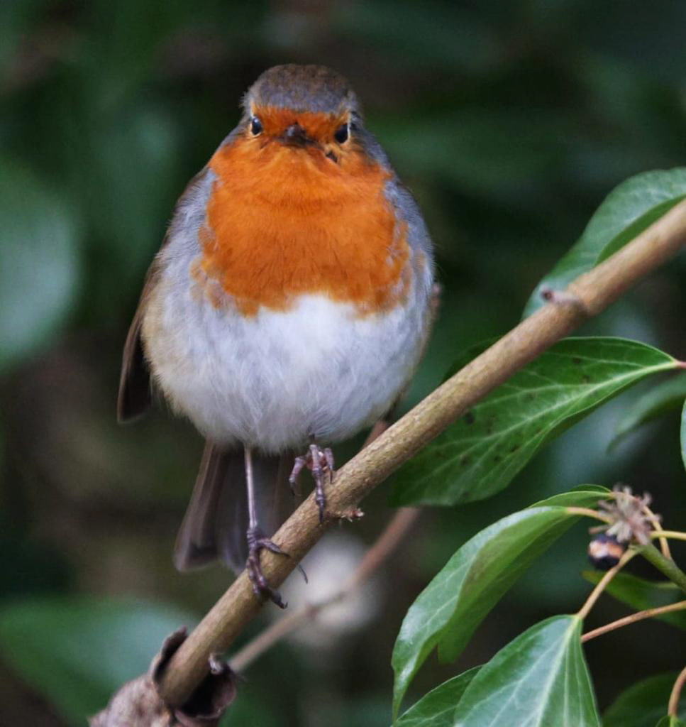
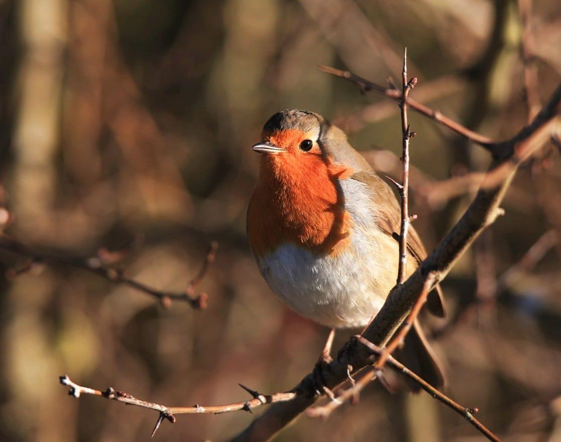
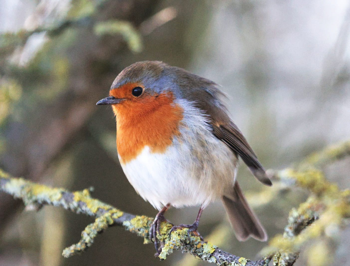
The robin in my project has a shy and gentle personality. At first, he feels nervous and unsure in the new environment, observing quietly before taking any action. He is naturally curious, often noticing small details around him and exploring cautiously, which reflects his thoughtful and sensitive nature.
As the story unfolds, the robin gradually becomes more confident and open, especially through his friendship with the sparrow. This shows his ability to adapt and find comfort in unfamiliar situations. He is also kind-hearted and sensitive, which allows him to connect emotionally with others and respond warmly to the new experiences he encounters.
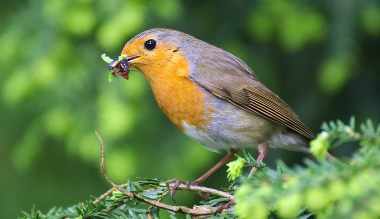
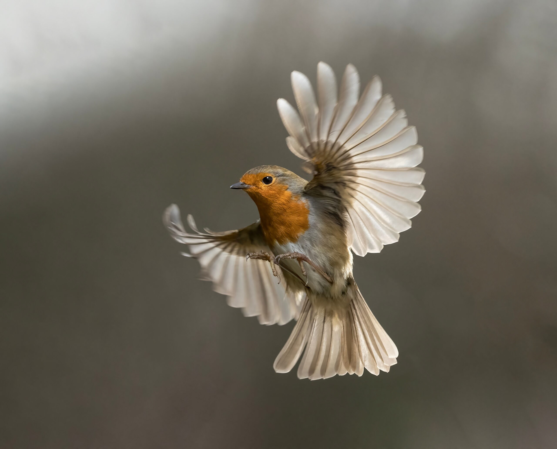
I conducted extensive research on robins to inform the design and personality of the main character in my project. I studied photographs, videos, and natural history references to observe their physical characteristics, including their round, compact bodies, small beaks, and the distinctive red-orange breast that makes them instantly recognizable. I paid particular attention to how their feathers catch light, how their wings move during flight, and the subtle textures that give them a lifelike presence. These details are important because they help me create a visually appealing and believable illustrated character, even when stylized for storytelling purposes.
In addition to their appearance, I researched robin behaviour and temperament. Robins are often curious, alert, and sometimes shy—traits that fit the personality I want for my character. I observed how they perch, hop along branches, and interact with their surroundings, taking note of gestures and movements that convey emotion. This helps me translate real-life behaviour into expressive illustrations that communicate the robin’s feelings, such as curiosity, nervousness, or delight.
I also considered the symbolic and cultural associations of robins, such as their connection to new beginnings, warmth, and seasonal change. These ideas reinforce the narrative of the robin travelling to a new place and gradually finding comfort, tying the character’s design to the emotional themes of the project. By combining careful observation, behavioural study, and creative interpretation, I aim to create a robin that feels alive, relatable, and visually expressive, allowing the audience to connect with the character on both an emotional and aesthetic level.
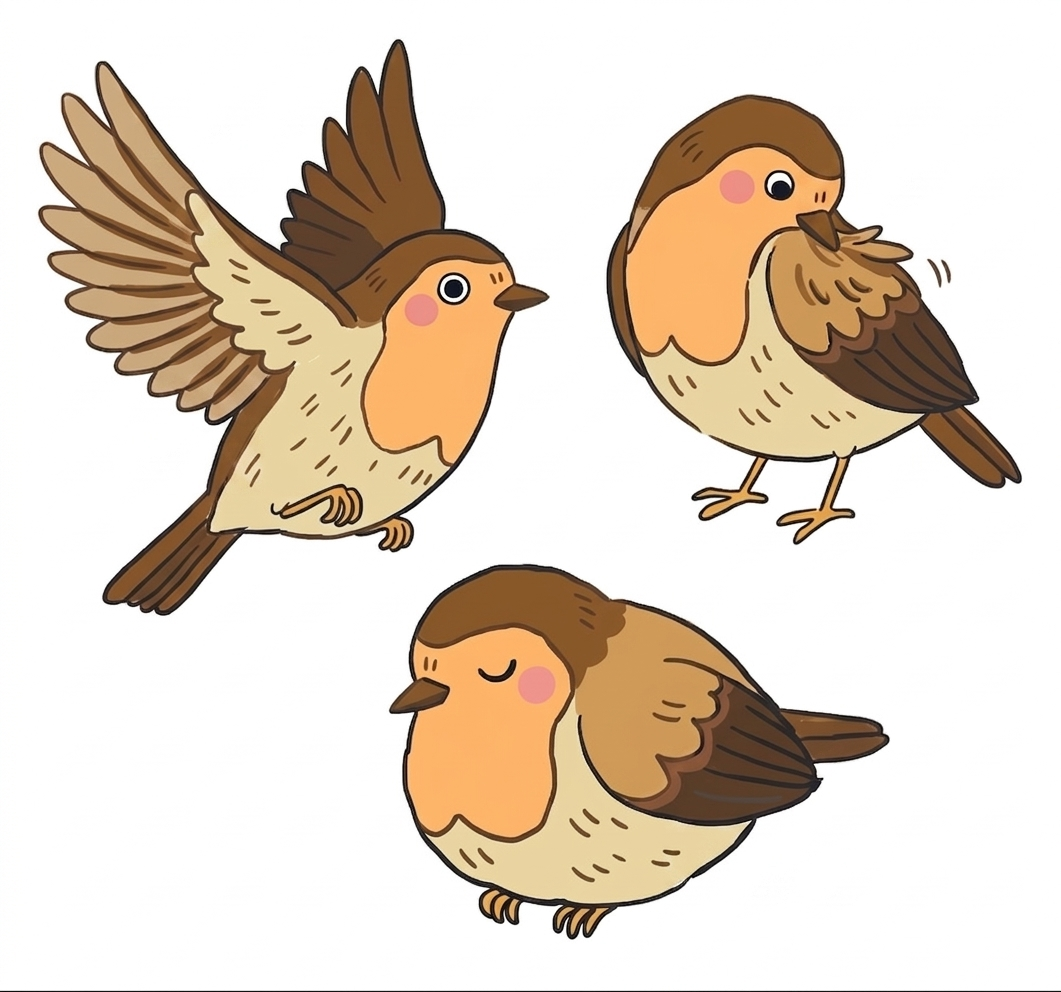
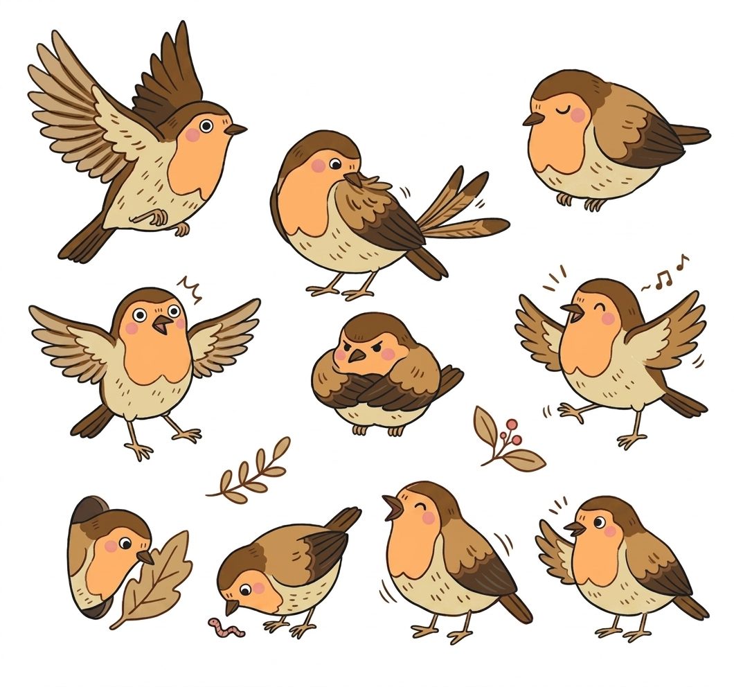
I tried to draw several sketches of the robin in different gestures and explored its final expression. Through these initial drawings, I focused on understanding the character’s body language, proportions, and emotional personality. I experimented with a range of poses to see how the robin could communicate movement, mood, and narrative more clearly, rather than simply functioning as a symbolic image.
During this sketching process, I paid attention to how small changes in posture could completely change the character’s feeling. For example, a slightly tilted head created a sense of curiosity, while a lowered body position suggested caution or shyness. More open wing positions gave the robin a livelier and more energetic feeling, while still poses made it feel calm and observant. These variations helped me understand how to use gesture as a storytelling tool, especially in a visual book format where expression needs to be immediately readable.
By testing different gestures, I was able to develop a stronger sense of how the robin behaves within the story world. Some sketches emphasized curiosity and alertness, while others focused on calmness or interaction with the environment. This exploration helped me refine the character’s personality and ensure that it supports the emotional tone of the narrative, rather than acting only as a decorative element.
Through this process, I also began to think more carefully about clarity and audience communication. Since the robin is meant to be a familiar and accessible character, I aimed to keep the design simple but expressive, avoiding overly complex details that might distract from its emotions. This helped me focus on readability, especially when the character will be used across different scenes in the story.
In the final design, I selected the expression and gesture that felt most natural, balanced, and emotionally clear. This decision helped the robin become a more engaging character, allowing it to communicate warmth, familiarity, and everyday life within the UK setting, while also supporting the overall narrative about movement, identity, and cultural transition.
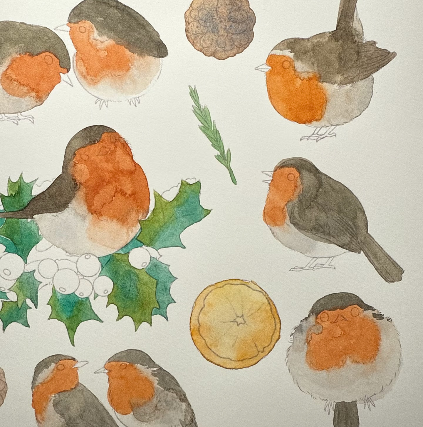
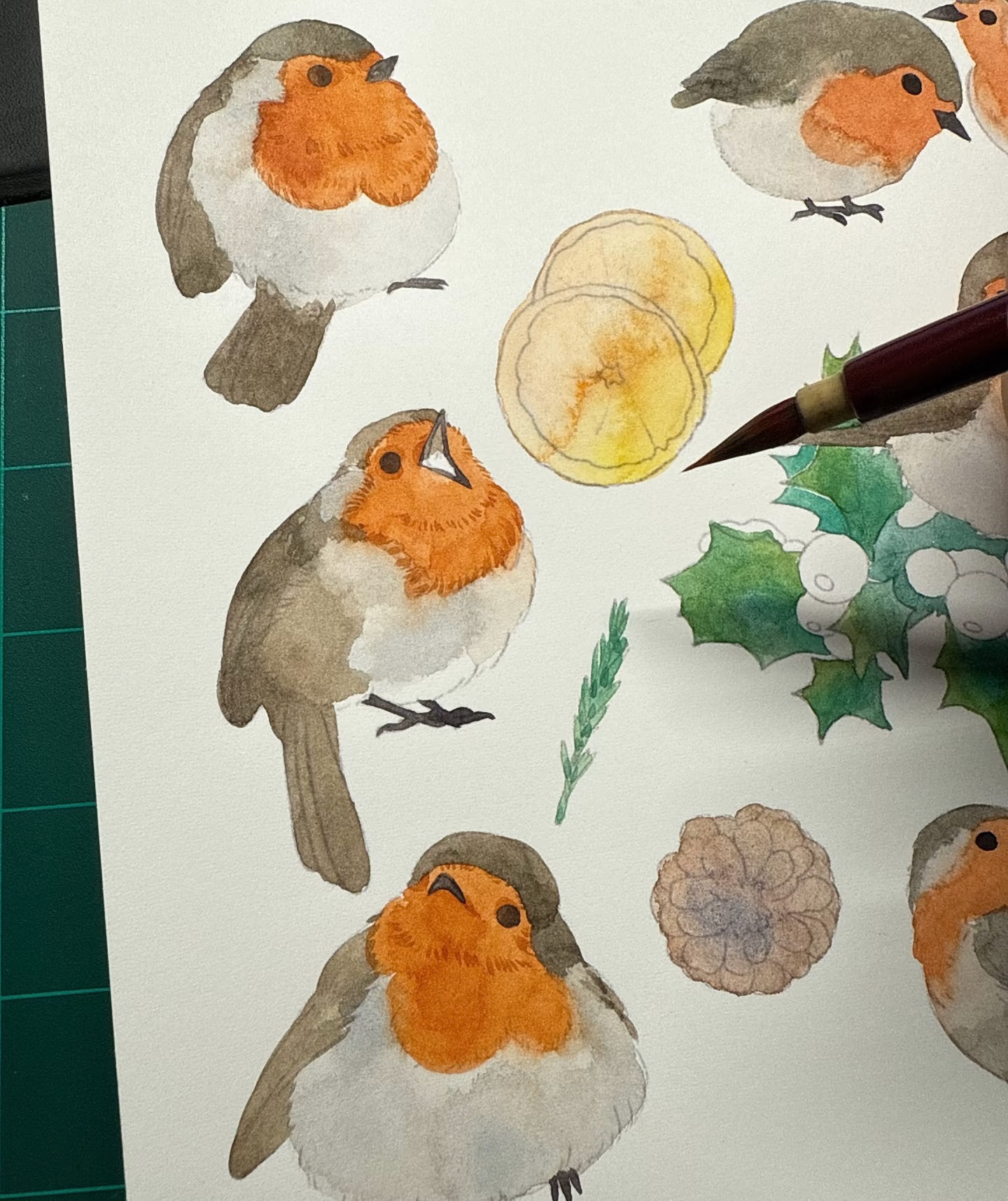
what materials I use ?
I used watercolor as the main material to draw the robin. I chose watercolor because it allows me to create soft textures and gentle color transitions, which match the emotional tone of my story. The medium also helps me express a light and natural atmosphere, making the character feel more alive and organic.
When painting the robin, I layered different tones gradually to build up the form and volume of the bird. Lighter washes were used for the base colours, while slightly deeper tones were added to create shadows and define the body structure. This layering process helped me control the transparency and softness of the image, which is a key characteristic of watercolor.
I also enjoyed how watercolor naturally blends on paper, which allowed me to create smoother transitions in the feathers and subtle variations in colour. This made the robin feel more delicate and expressive, rather than overly rigid or digital. In addition, I used a fine brush for details such as the eyes and outline of the beak, so the character could still maintain clarity and focus.
Overall, using watercolor helped me develop a more warm, hand-made feeling for the robin illustration. It supports the gentle and emotional tone of my project, while also enhancing the storytelling quality through soft textures and natural colour flow.
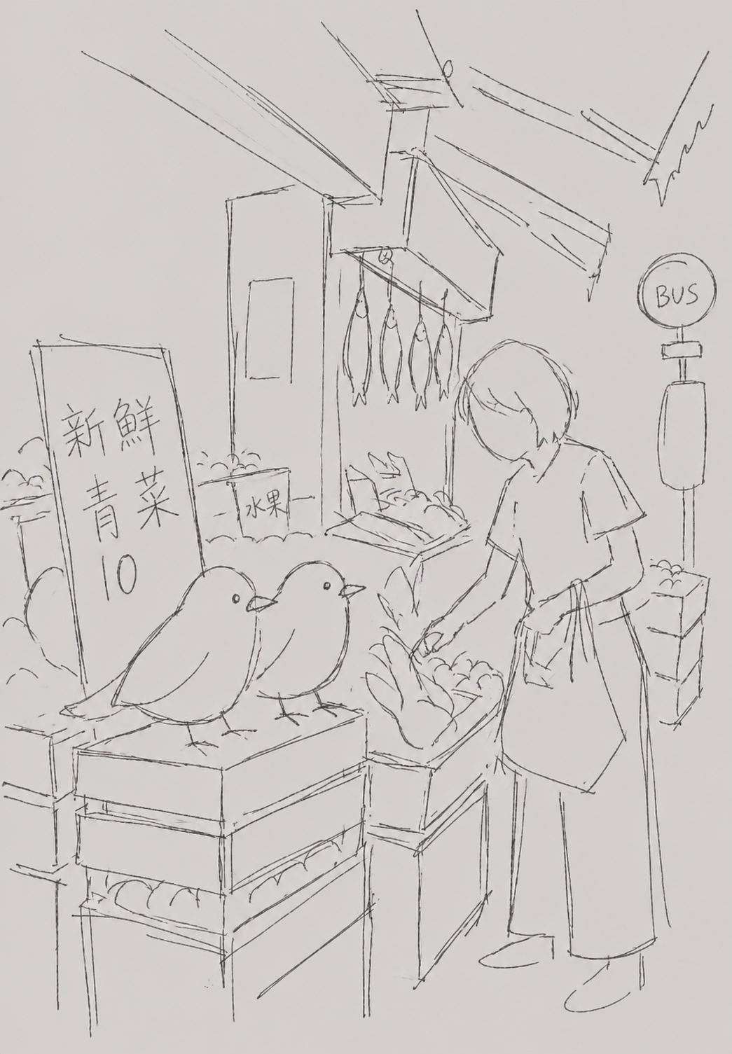
Final outcome
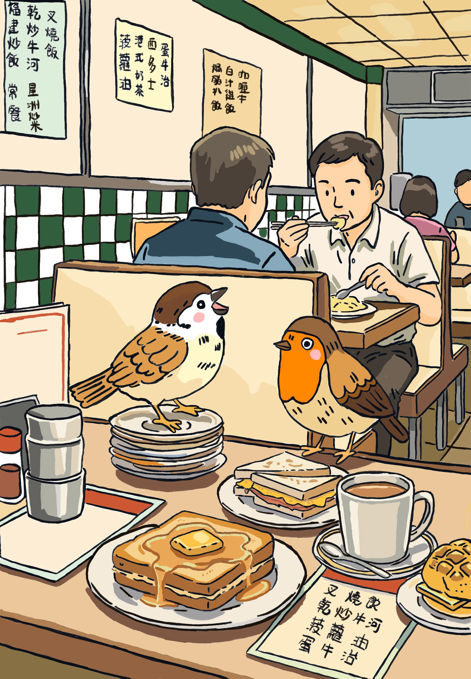
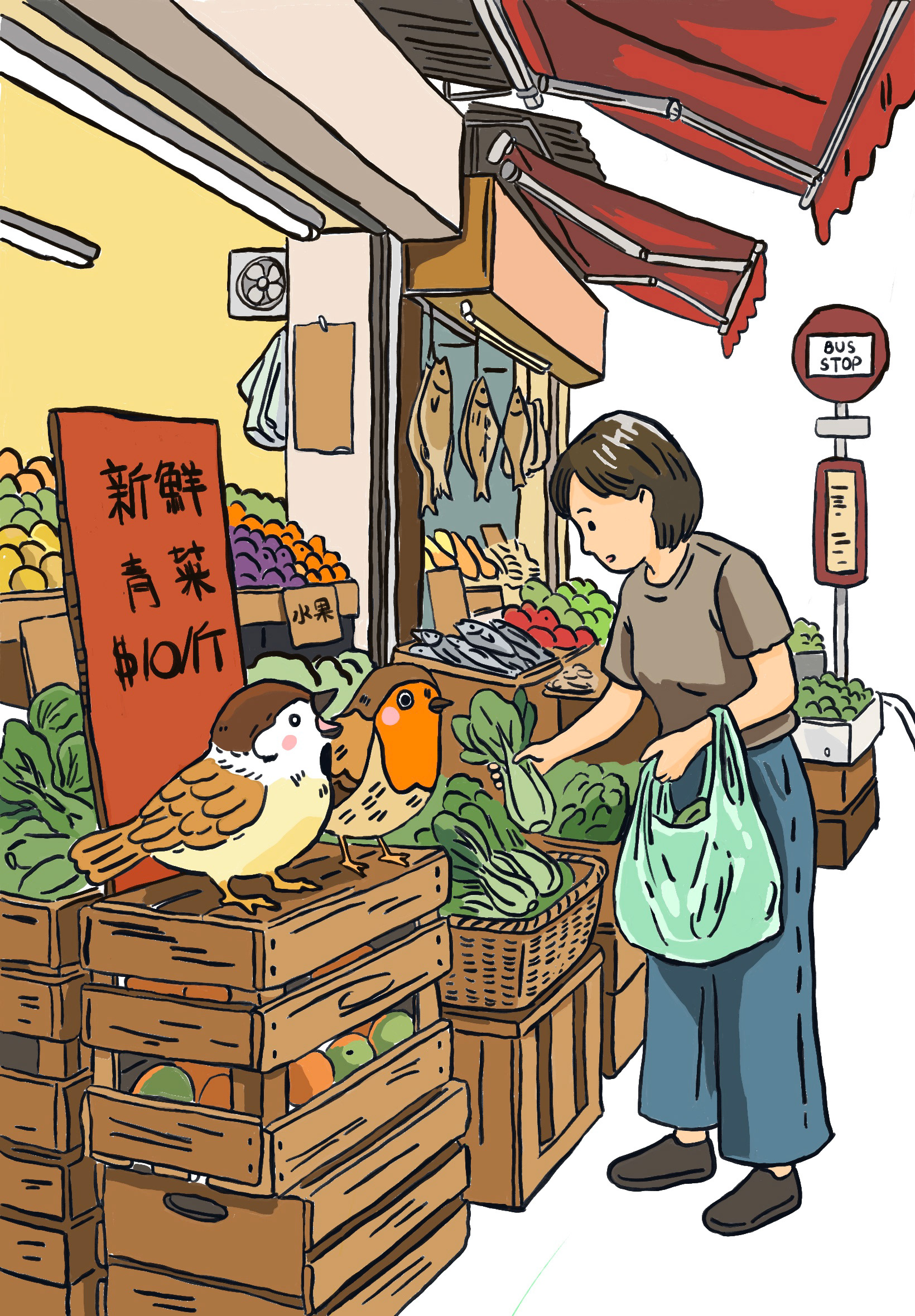
Reflection
Reflecting on this place project, I realise that the use of sparrows and robins helped me approach the idea of place in a more personal, subtle, and symbolic way. Instead of focusing on obvious landmarks or direct representations of Hong Kong and the United Kingdom, I became more interested in small, everyday living details that quietly shape how I experience each environment.
At the beginning of the project, I mainly understood these birds as simple visual references linked to different locations. However, through repeated drawing, observation, and thinking, they gradually developed into emotional symbols. The sparrow began to represent the energy and density of urban life in Hong Kong—fast movement, noise, familiarity, and constant presence in everyday spaces. The robin, which I encountered more in the UK, became associated with stillness, visibility, and a slower rhythm of attention, often appearing in quieter or more open environments.
As the project developed, I started to realise that these meanings were not fixed or purely geographical. Instead, they were shaped by my own emotional responses and changing perception. The birds became a way for me to understand how I move between different states of mind when I am in different places, and how memory and attention influence what I notice.
This process also changed my way of observing the world. I became more sensitive to small, living elements in my surroundings, and began to see them as part of a larger emotional map of place. Rather than treating place as something external or static, I now understand it as something constructed through experience, repetition, and personal interpretation over time.
Overall, this project helped me develop a more reflective and intuitive approach to visual storytelling. By using simple natural symbols, I was able to connect external environments with internal feelings, and to explore how identity and belonging can be shaped through small, quiet observations rather than major events or obvious imagery.